Text Controls in the Layout Pane
This section describes the parameters in the Layout pane of the Text Inspector. Some parameter groups remain hidden until you expand them by clicking the Hide/Show icon to the right of the group header.
Click the Hide/Show icon on the right side of the group header row. (The icon is not visible until you move the pointer over it).
Click the reset button on the right side of the group header row.
Note: Resetting parameter groups does not affect the activation checkbox for the group.
General Text Controls in the Layout Pane
Use the Text Layout controls in the Layout pane of the Text Inspector to specify general arrangement of your text. These controls allow you to make text flow in a single line, in a paragraph with set margins, or on a path.
- Layout Controls: This section of the Layout pane contains basic layout options for a text object.
- Layout Method: Use this pop-up menu to specify whether the text layout is set to Type, Paragraph, Path, Scroll, or Crawl.
Note: When Layout Method is set to Scroll or Crawl, the Transform Glyph tool is not available. The Offset, Rotation, and Affects Layout parameters in the Format pane are also not available.
The Layout Method menu has the following options:
- Type: Creates a single line of text. This is the default method. As text is added, the string of text continues off the Canvas. If you create multiple lines of text by using hard returns, set Layout Method to Paragraph. This will allow you to use the Margin controls, as well as align text when using tabs.
- Paragraph: Makes the Margin controls available in the lower area of the Layout pane. Use the sliders to change margin size. Double-clicking the text in the Canvas when Layout Method is set to Paragraph displays a ruler and scroll control around the text entry field. When text is deleted from a paragraph text entry field, paragraph margins do not scale. For information on modifying or creating a paragraph, see Adding Paragraph Text in the Canvas.
- Path: Creates text on a path and makes the Path Options parameter group available. The path can be an open or closed spline, a circle, a rectangle, a wave, or based on a shape.
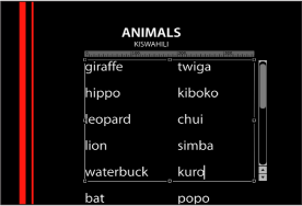
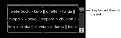
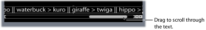
- Scroll: Positions the margins of the text entry field to match the project’s safe zones in preparation for a scrolling animation. When Layout Method is set to Scroll, double-clicking the text in the Canvas displays a ruler and an enhanced scroll control that displays a preview of the text. Drag in the scroll bar to navigate through large amounts of text. For more information on safe zones, see Zones. Scroll does not animate the text—text is only positioned and formatted in preparation for you to create scrolling animation using keyframes or behaviors. For more information on animating text, see Animating Text. When Layout Method is set to Scroll, the following occurs: The Transform Glyph tool is not available; the Offset, Rotation, and Affects Layout parameters in the Format pane are not available; and the text is flattened, so the Flatten, Render Text, and Face Camera parameters are not available. (For more information, see the Flatten parameter description below.)
- Crawl: Positions the text in a single string (within project safe zones) along the bottom of the project in preparation for a crawl or ticker-type animation. Double-clicking the text in the Canvas when Layout Method is set to Crawl displays a scroll control below the text entry field. Crawl does not animate the text—text is only positioned and formatted in preparation for you to create an animation using keyframes or behaviors. For more information on animating text, see Animating Text. When Layout Method is set to Scroll, the following occurs: Tabs are not available; the Transform Glyph tool is not available; the Offset, Rotation, and Affects Layout parameters in the Format pane are not available; and the text is flattened. As a result, the Flatten, Render Text, and Face Camera parameters are not available. (For more information, see the Flatten parameter description below.)
- Auto-Shrink: Use this pop-up menu, available when Layout Method is set to Paragraph, Scroll, or Crawl to change the vertical or horizontal scale of selected letters to ensure the text fits within the margins of the text object. Choose one of the following options:
- Off: No scaling occurs. Text exceeding the width or height of the text object extends beyond the visible edges of the screen for scrolling or crawling text, or wraps to the next line for paragraph text.
- Left And Right: Scaling occurs at the left and right margins of the text object. This setting is primarily used with scrolling text, to ensure that no characters are cut off. However, it can be applied to other text objects.
- Top And Bottom: Scaling occurs at the top and bottom margins of the text object. This setting is primarily used for crawling text, to ensure that no characters are cut off. However, it can be applied to other text objects.
- To All Margins: Scaling occurs at the left, right, top, and bottom margins of the text object.
- Crop At Margins: Select this checkbox to crop text that extends past the margins of the text object. This control is disabled when Auto-Shrink is enabled.
Note: For Crop At Margins to be active, Layout Method must be set to Paragraph, and the text object must be flattened. For more information about flattening text, see Adding Behaviors and Filters to Text.
- Text Rendering: This group of controls in the Layout pane affects how text objects are displayed in 3D layers.
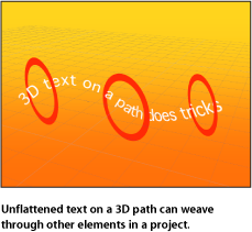
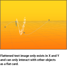
- Flatten: Select this checkbox to force text characters to remain in a 2D plane. In 3D groups, text characters on a path may be influenced by behaviors in ways that interfere with linear alignment. For instance, a simulation behavior might pull nearby text characters out of their plane. When Flatten is selected, the text can still interact with other objects in 3D space, but only as a flattened image, like a card.
After you select Flatten, the text characters no longer move in 3D space.
Use the following guidelines for the Flatten checkbox:
The Flatten checkbox must be selected for text to receive reflections. If the Flatten checkbox is not selected, the Reflections parameter does not appear in the Properties Inspector. For more information on using reflections, see Reflections.
The Flatten checkbox must be selected to use the 2D transform tools in the toolbar (Select/Transform, Anchor Point, Distort, Drop Shadow, Four Corner, and Crop).
The Flatten checkbox must be selected to apply a mask to text. The mask tools in the toolbar are not available when Flatten is deselected.
Note: When a text object rotated in Z space is flattened, text that is farther from the camera (further away in Z space) appears smaller. For more information, see Working with Objects Inside 2D Groups and Flattened 3D Groups.
- Render Text: Use this pop-up menu to choose a text rendering method. This control is not available when the Flatten checkbox is selected, or when Scroll or Crawl is selected from the Layout Method pop-up menu. The menu choices are:
- In Global 3D (Better): Allows text to intersect with objects in the text group and with objects in other groups. When this option is enabled, project performance and interactivity may slow. For text to cast shadows, In Global 3D (Better) must be enabled. For more information on using shadows, see Shadows.
- In Local 3D (Faster): Renders text more quickly, but does not allow for intersections with objects in the text group or with objects in other groups, nor does it allow text to cast shadows.
- Face Camera: Select this checkbox to force text characters to face the camera, even when the camera is rotated or the text is rotated. This checkbox is not available when the Flatten checkbox is selected (because text cannot face the camera and flatten to the text plane at the same time).
Additionally, this setting is not available when Scroll or Crawl is selected from the Layout Method pop-up menu (because those layout methods cause text to flatten).
Note: Because text characters are 2D (flat) objects, text may not be visible when you use orthogonal camera views, such as Left, Right, and Top (unless the text object or characters are rotated in 3D space). This is because orthogonal views are at right angles (perpendicular) to objects in the Canvas. For more information on using cameras, see Cameras.
- Behavior Controls: This group of controls in the Layout pane adjusts how a text object is treated when behaviors are applied, based on the position of the text object’s anchor point(s).
- Anchor Point: Use this pop-up menu to set the anchor point of text characters, rather than the anchor point of the text object. This allows you to rotate text around by character, word, line, or as a single object. You can rotate the text using the Format pane of the Text Inspector, or by applying a text sequence behavior.
To see a visual representation of the anchor point, select the text with the Transform Glyph tool. For more information on the Transform Glyph tool, see Working with Text Glyphs.
Note: The anchor point specified in the Layout pane is not the same as the anchor point for the object. Object anchor point controls are available in the Properties Inspector and via the Anchor Point tool in the toolbar. For more information on adjusting the anchor point of an object, see Using the Anchor Point Tool.
The Anchor Point pop-up menu has four options:
- Position: Use these value sliders to define the position of the anchor point specified in the Anchor Point pop-up menu. Click the disclosure triangle to display the X, Y, and Z value sliders. To see a visual representation of the anchor point, select the text with the Transform Glyph tool. For more information on the Transform Glyph tool, see Working with Text Glyphs.
- Type On: This group of controls in the Layout pane allows you to create a type-on effect, similar to a typewriter-style animation. You can keyframe the type-on effect to occur forward or backward, or to move in both directions.
Note: There is also a Text Animation behavior called Type On that creates a forward type-on effect without setting keyframes. For more information on using that behavior, see Type On Behavior.
The Type On parameter group has the following controls:
- Start: Use this slider to set the start point of the type-on effect (from the left side of the text). When set to the default 0%, the text is fully “typed on.” When set to 100%, the text is fully “typed off.” If the value animates from 0 to 100 over time, the text types off from left to right. If the value animates from 100 to 0, the text types on from right to left.
- End: Use this slider to set the end point of the type-on effect (from the right side) of the text. When set to the default 100%, the text is fully “typed on.” When set to 0%, the text is fully “typed off.” If the value animates from 100 to 0 over time, the text types off from right to left. If the value animates from 0 to 100, the text types on from left to right.
- Fade In: Select this checkbox to cause text characters to fade on or off. When Fade In is deselected, the text characters pop on as they appear.
For information on the Motion Path parameters, see Text Path Options in the Layout Pane.


Text Path Options in the Layout Pane
This group of controls in the Layout pane lets you specify the initial shape of a text path, and to modify the path and text on that path. This group is only active when the Layout Method pop-up menu at the top of the Layout pane is set to Path.
For more information about creating a text path, see Text Layout-Related Tasks.
The Transform Glyph tool can be used with text on a path. For more information, see Working with Text Glyphs.
- Path Shape: Use this pop-up menu to set the shape of the path. Choosing different shapes will cause different controls to appear in the Path Options parameter group. Parameters are described below. There are six menu options:
- Open Spline: The default shape, a straight path defined by one point at the beginning and one point at the end of the path. You can work with Bezier or B-Spline control points. Option-click (or double-click) on the path to add points.
- Closed Spline: A closed path where the last point is in the same location as the first point. You can use Bezier or B-Spline control points. Option-click (or double-click) on the path to add points.
- Circle: A simplified version of Closed Spline, in which the X radius or Y radius can be adjusted to create a circle or an ellipse.
- Rectangle: A closed path where the width and the height can be adjusted to create a square or a rectangle.
- Wave: A wavy path (a sine wave) defined by one point at the beginning and one point at the end, and controlled by the End Point, Amplitude, Frequency, Phase, and Damping parameters.
- Geometry: A shape path where the object travels along the edge of a shape or mask. An animated shape can be used as the text path source—for example, a circle shape with an applied Oscillate Shape behavior.
- Path Type: Use this pop-up menu, available when Path Shape is set to Open Spline or Closed Spline, to choose how to manipulate the shape of the path:
- Bezier: Lets you manipulate the keyframe curve by dragging Bezier handles. For more information about creating and adjusting Bezier curves, see Editing Bezier Control Points.
- B-Spline: Lets you manipulate the keyframe curve by dragging B-Spline points. B-Splines are manipulated using points—there are no tangent handles. The points themselves do not lie on the surface of the shape. Instead, each B-Spline control point is offset from the shape’s surface, magnetically pulling that section of the shape toward itself to create a curve. B-Splines are extremely smooth: By default, there are no sharp angles in B-Spline shapes, although you can create sharper curves, if necessary. For more information about working with B-Spline curves, see Editing B-Spline Control Points.
- Radius: Use this slider, available when Circle is the defined path shape, to change the size of the circular path. Click the disclosure triangle to adjust the X radius and Y radius.
Note: When the Text tool is selected, you can also use onscreen control points to resize the circle. Press Shift to resize the X and Y radii uniformly.
- Size: Use this slider, available when Rectangle is the defined path shape, to change the size of the rectangular path. Click the disclosure triangle to adjust the X scale and Y scale.
Note: When the Text tool is selected, you can also use onscreen control points to resize the rectangle. Press Shift to resize the X and Y scales uniformly.
- Start Point: Use these value sliders, available when Wave is selected in the Path Shape pop-up menu, to set the location of the start point on the wave’s path. The left value slider sets the X coordinate of the start point. The right value slider sets the Y coordinate of the start point. The start point can also be adjusted using the wave’s onscreen controls (active by default when the Text tool is selected).
- End Point: Use these value sliders, available when Wave is selected in the Path Shape pop-up menu, to set the location of the end point on the path. The left value slider sets the X coordinate of the end point. The right value slider sets the Y coordinate of the end point. The end point can also be adjusted using the wave’s onscreen controls (active by default when the Text tool is selected).
- Phase: Use this dial, available when Wave is selected in the Path Shape pop-up menu, to define the percentage of the offset of the waves from the start and end points of the path.
When set to 0% (default), the wave begins and ends at half the distance from the highest point to the lowest point in the wave. When set to 90%, the wave begins and ends at the highest point in the wave. When set to –90%, the wave begins at the lowest point in the wave. When set to 180%, the waves are the same as 0%, but inverted.
- Attach to Shape: Select this checkbox, available when the Path Shape pop-up menu is set to Geometry, to force the motion path to follow the source shape at the shape’s original location. When Attach to Shape is deselected, the motion path can be offset from its source shape (by dragging the shape object to a new location in the Canvas).
Note: When Attach to Shape is selected, you cannot drag the shape object to another location.
To learn how to use spline objects as a text path source shape, see Using Geometry for a Path Source.
Margin Controls in the Layout Pane
This group of controls—available when the Layout Method is set to Paragraph, Scroll, or Crawl—sets the size and location of text margins.
When a text file is imported into Motion, its margin and tab information is retained in the Motion project. The Layout Method (in the Layout pane of the Text Inspector) for the imported text is set to Paragraph.
By default, text created in Motion is set to Type, creating one string of text until you enter a line break. To create columns with tabs or to use margins with text created in Motion, Layout Method (in the Layout pane of the Text Inspector) must be set to Paragraph or Scroll.
There are several ways to create and adjust text margins, including using onscreen controls and the Layout pane in the Text Inspector. You can set a margin for text before or after it is created.
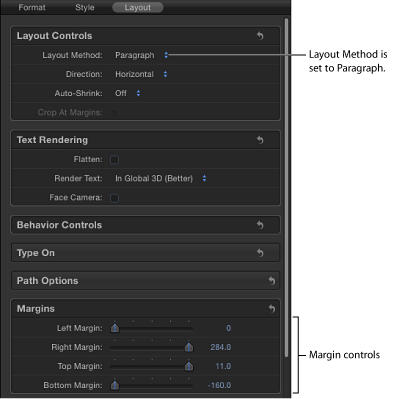
- Left, Right, Top, and Bottom Margins: Use these sliders, available when Layout Method is set to Paragraph, Scroll, or Crawl, to define the text margins in the Canvas.
For more information on working with margins, see Text Margin and Tab-Related Tasks.
Tab Controls in the Layout Pane
Motion allows paragraph-formatted text to contain an unlimited number of tabs to control word spacing in text. By default, text created in Motion has no tabs, so there are no controls in the Tabs section of the Layout pane. Adding, moving, and removing tabs is done in the Canvas. You can also move tabs by modifying their values in the Inspector. When a Rich Text Format (RTF) file is imported, tabs in the RTF file are retained in the Motion project and appear in the Tabs section of the Layout pane.
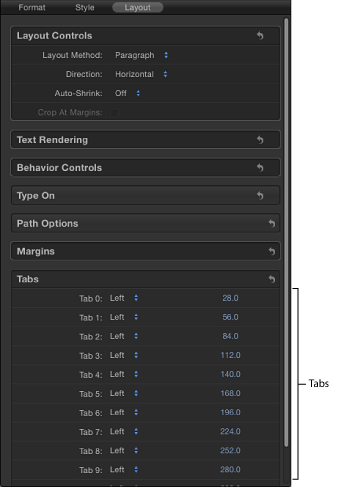
- Tab 0, 1, 2, and so on: Lists the tabs in the paragraph, including their type and positions.
- Tab type pop-up menu (unlabeled): Use this pop-up menu to set the tab to Left, Center, Right, or Decimal.
- Tab value slider (unlabeled): Use the value slider to adjust the position of the tab.
Tabs can also be added, moved, and removed in the Canvas. For more information on working with tabs, see Text Margin and Tab-Related Tasks.