Building a Rig
A rig is a container for widgets. Adding a rig has no effect until you begin to add widgets and create snapshots for the widgets to control. A project can have an unlimited number of rigs, and each rig can have an unlimited number of widgets.
Choose Object > New Rig (or press Command-Control-R).
In the Inspector, open a parameter’s Animation menu (the downward arrow on the right), choose Add To Rig > Create New Rig, then choose a widget type from the submenu.
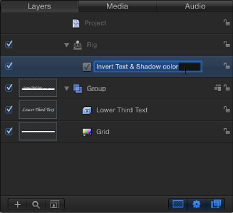
A new rig is added to the project. Rigs appear as objects in the Layers list. In the Timeline, rigs are represented as blank tracks because they cannot be edited in time.
When you add a rig to a project using the first two methods described above (via the Object menu or its keyboard shortcut), no widgets are created. You must add them manually. (For more information, see Adding Widgets to a Rig.) However, when you add a rig using the Animation menu, the widget you choose in the menu is created immediately and appears in the Rig Inspector, the HUD, and the Layers list (underneath the Rig object).
Note: Although rigs and their widgets appear as blank tracks in the Timeline, slider widgets can be keyframed, and those keyframes can be displayed in the Timeline.
Adding Widgets to a Rig
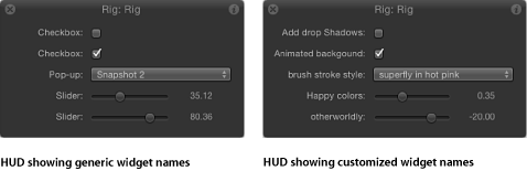
A rig has no effect until it contains a widget. Widgets are special controls used to drive parameters in the project. Widgets can be reordered and renamed. Renaming widgets can be important if you have multiple widgets of the same type. Otherwise you see a list of controls that have identical, generic names.
When viewing the Widget Inspector, the controls for the widget are displayed. When viewing the Rig inspector, controls for all of widgets in the rig are displayed.
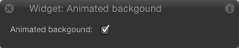
When a single widget is selected, the HUD displays only the widget control, not the parameters used to modify the widget or the parameters driven by the widget.
When a rig is selected, the HUD shows all widget controls assigned to that rig (as seen in the two-up figure above).
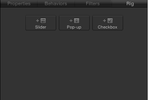
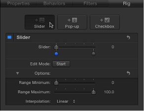
Select the rig in the Layers list, then click an Add Widget button in the Rig Inspector. There are three choices: Add Slider, Add Pop-up, and Add Checkbox.
Drag a parameter row from any Inspector pane to a rig object in the Layers list. Dropping the parameter row immediately on the rig object creates a slider widget. Pausing briefly causes a drop menu to appear, allowing you to select the widget type you want to create.
Add a widget from the Animation menu of a parameter. For more information, see Controlling Rigs from Parameter Animation Menus.
Widgets are represented in four places in the Motion project window:
In the Layers list, under the parent rig.
In the Rig Inspector. If the rig has multiple widgets, they all appear here.
In the HUD.
In the Widget Inspector.
In the Layers list, drag the widgets into the order you want them to appear.
Click the widget name in the Layers list and enter a new name.
Note: If the widget has been published, the name change does not carry through to the published parameter. To synchronize names, rename the widget manually in the Publishing pane of the Project Inspector, or unpublish and republish the newly named widget.
Widget Types
Each widget type—pop-up menu, checkbox, and slider—has a distinct set of controls in the Rig Inspector and Widget Inspector.
By default, each widget is named according to its type (“Checkbox,” for example). However, you can assign a custom name to identify the settings the widget will affect. Change the default name by double-clicking the widget name in the Layers list, then entering a name.
Note: Widget names cannot be changed in the Inspector.
Checkbox
Checkbox widgets allow you to switch between two snapshots, that is, between two sets of parameter states. Typically, checkbox widgets are used to create an on/off type of effect, although you can store any parameter states in either snapshot, creating more of a toggle effect.
The activation checkboxes in the Rig Inspector (highlighted blue when selected) and in the Layers list (beside the checkbox widget) have no effect on the constituent parameters of the checkbox.
Checkbox widgets contain the following controls in the Rig Inspector and Widget Inspector:
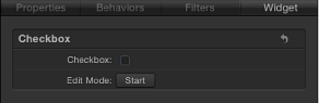
- Edit Mode: Click the Start button to enable snapshot recording. For more information about recording snapshots, see Managing Parameter Snapshots.
Note: When you record a snapshot (using the Edit Mode button or the methods described in Managing Parameter Snapshots), the affected parameters (those you modify in the Inspector or via onscreen controls in the Canvas) are added to the widget. When you finish recording a snapshot, new controls for the modified parameters appear in the Widget Inspector. These parameters are duplicates of the same parameters that occur in other Inspector panes. Parameters controlled by a rig display a special icon (a joystick) on the right side of the parameter row in the Inspector.
Pop-up Menu
Pop-up menu widgets are similar to checkbox widgets but allow you to save more than two parameter states (snapshots). Each item in a pop-up menu widget represents a snapshot. When you choose an item in the pop-up menu, the affected parameters in your project toggle to a different saved state.
The activation checkboxes in the Rig Inspector (highlighted blue when selected) and in the Layers list (beside the pop-up menu widget) have no effect on the constituent parameters of the pop-up menu.
Pop-up menu widgets contain the following controls in the Rig Inspector and Widget Inspector:
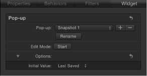
- Edit Mode: Click the Start button to enable snapshot recording. For more information about recording snapshots, see Managing Parameter Snapshots.
Note: When you record a snapshot (using the Edit Mode button or the methods described in Managing Parameter Snapshots), the affected parameters (those you modify in the Inspector or via onscreen controls in the Canvas) are added to the widget. When you finish recording a snapshot, new controls for the modified parameters appear in the Widget Inspector. These parameters are duplicates of the same parameters that occur in other Inspector panes. Parameters controlled by a rig display a special icon (a joystick) on the right side of the parameter row in the Inspector.
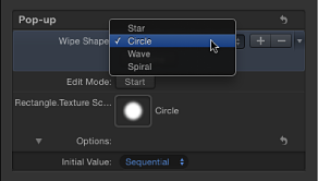
- Initial Value: Use this control (in the Options section) to set the initial value for the pop-up menu widget when it is published and used as a template in Final Cut Pro X. There are three options:
Last Saved: When the template is used in Final Cut Pro, the pop-up menu value defaults to the menu item assigned when the project was last saved. This option ensures a consistent pop-up menu state, while still permitting users to choose alternate states manually. This is the default setting.
Sequential: Each time the template is used (in a single project) in Final Cut Pro, the setting of this pop-up menu changes, rotating through the available menu items. The first time the template is used, this pop-up menu defaults to the first menu item. The next time the template is used, the pop-up menu is set to the second menu item, and so on. For example, in a wipe transition template with a pop-up menu widget assigned to control the shape of the wipe, the first time you add the template to the Final Cut Pro timeline, the wipe is a star; the next time you apply the template to the Final Cut Pro timeline, the wipe is a circle, and so on.
Random: Each time the template is used in Final Cut Pro, another menu item from this pop-up menu is assigned by default. For example, in a title template with a pop-up menu widget assigned to control the title’s font, each successive time the title is used in a project, a font is randomly selected from the font list.
Slider
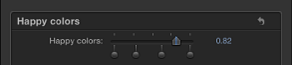
Slider widgets let you select values interpolated between snapshots. When you drag the slider, the affected parameters change gradually, ramping between the values of adjacent snapshots. Each snapshot assigned to a slider is represented by a separate snapshot tag—a small shaded circle underneath the slider widget.
Double-click the area below the slider to add snapshot tags. Parameters at this position inherit their values based on the interpolation point between the two snapshot tags. For example, in a slider mapped to the Color parameter, adding a tag midway between snapshot tags set to red and blue generates a snapshot set to purple.
Snapshot tags can be dragged left and right and even reordered.
To delete a snapshot tag, drag it away from the area under the slider.
Clicking a snapshot tag sets the value of the slider to the tag's value and enables the tag’s snapshot for editing. Setting the slider to values between tags causes the rigged parameter values to be interpolated between the surrounding snapshot values.
The activation checkboxes in the Rig Inspector (highlighted blue when selected) and in the Layers list (beside the slider widget) have no effect on the constituent parameters of the slider.
Slider widgets contain the following controls in the Rig Inspector and Widget Inspector:
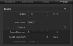
- Snapshot Tag: Use the small shaded circles underneath the slider indicate saved snapshots. Double-click below the slider to add snapshot tags. Add as many snapshot tags as you want. Snapshot tags work similarly to tags that represent individual colors in a gradient. To learn how tags are used when creating gradients, see Gradient Editor.
- Edit Mode: Click the Start button to enable snapshot recording. For more information about recording snapshots, see Managing Parameter Snapshots.
Note: When you record a snapshot (using the Edit Mode button or the methods described in Managing Parameter Snapshots), the affected parameters (those you modify in the Inspector or via onscreen controls in the Canvas) are added to the widget. When you finish recording a snapshot, new controls for the modified parameters appear in the Widget Inspector. These parameters are duplicates of the same parameters that occur in other Inspector panes. Parameters controlled by a rig display a special icon (a joystick) on the right side of the parameter row in the Inspector.
- Range Maximum: Use this parameter (in the Options section) to set the high end of the numeric range displayed next to the slider widget. For example, if you want the slider widget to range from 0 to 11, set Range Maximum to 11. If you want the slider widget to range from 0 to 100, set Range Maximum to 100.
Note: Range Minimum and Range Maximum have no effect on the actual parameter values that the slider widget controls. Range Minimum and Range Maximum merely designate an arbitrary numeric range that is displayed next to the slider widget.
- Interpolation: A pop-up menu (in the Options section) controlling how values on the slider are interpolated. The interpolation applies to the segment of the slider between the current tag and the next one. You can set interpolation methods for each segment of the slider. By default, all segments are set to Linear. There are three options:
Constant holds the value of the first snapshot until the slider reaches the next snapshot, at which point the parameter changes. (This is similar to changing states using a pop-up menu widget.)
Linear creates a simple interpolation between states.
Ease creates a smooth interpolation, where the effect is weighted towards the nearer snapshot tag.