Apply a different style to a chart
The thumbnail images at the top of the Chart sidebar represent predesigned chart styles that are specifically made to look good with the template you’re using. You can apply a different style to a chart at any time.
Select the chart.
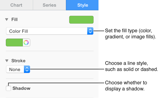
Click the Chart tab at the top of the sidebar on the right.
If you don’t see a sidebar, or it doesn’t have a Chart tab, click
 in the toolbar.
Click one of the chart styles at the top of the sidebar.
If you can’t edit a chart, it may be locked. Unlock it to make changes.