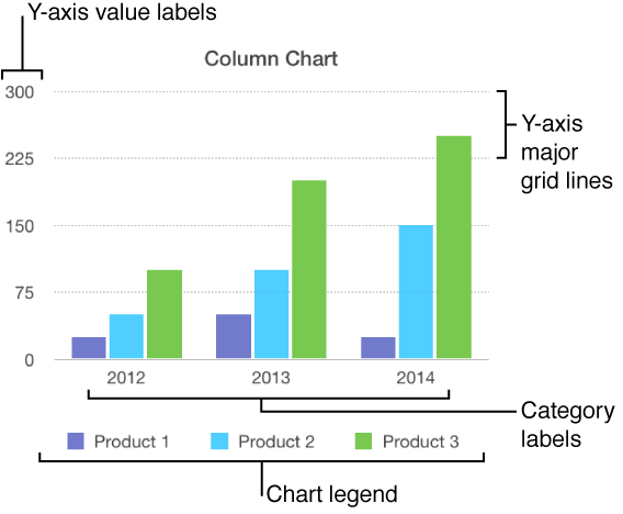
There are several types of chart markings and axis labels you can add to your charts. You can modify their appearance to emphasize your data.
Charts have a placeholder title (“Title”) that’s hidden by default. You can show and rename the chart title.
Select the chart.
In the sidebar on the right side of the Pages window, click the Chart tab at the top of the sidebar.
If you don’t see the sidebar, or it doesn’t have a Chart tab, click ![]() in the toolbar.
in the toolbar.
Select the Title checkbox.
Double-click the placeholder title, then type your own.
To change the appearance of the title, such as its font, size, and color, double-click the title again, then use the controls in the Chart Font section of the sidebar to make changes.
Bar, column, line, area, and pie charts have labels that show the values of specific data points. By default, these value labels are hidden for new charts, but you can make them visible and specify a format (for example, number, currency, or percentage), change their font and color, and more.
Select the chart.
Click the Series tab at the top of the sidebar on the right.
If you don’t see the sidebar, or it doesn’t have a Series tab, click ![]() in the toolbar.
in the toolbar.
Click the disclosure triangle next to Value Labels, then choose a number format from the pop-up menu.
Note: Depending on the type of chart, this section may have a different name. For example, an interactive bubble chart has a Bubble Labels section. For scatter charts, you choose an axis, then set value labels.
Use the other controls to make further adjustments to the labels.
Add a suffix or prefix: The text you enter is added to the beginning or end of the label.
Specify where numbers appear: Choose an option from the Location pop-up menu.
Show the thousands separator: Select the Thousands Separator checkbox.
To change the font, color, and style of the labels, click any value label on the chart.
All value labels for that series are selected.
In the Value Labels section of the sidebar, use the controls to make changes.
Only the labels for the selected data series are modified. To change labels for another series, click one of its labels, then make changes.
To select multiple series, select one, then Command-click another. To select all series, select one, then press Command-A.
If you change the font for the entire chart, the font for the value labels also changes.
Tip: You can create a custom format for displaying numbers or date and time.
Select the chart.
To make changes for only one wedge, click it.
Click the Wedges tab at the top of the side bar on the right.
If you don’t see the sidebar, or it doesn’t have a Wedges tab, click ![]() in the toolbar.
in the toolbar.
Click the disclosure triangle next to Labels, then do any of the following:
Show data point labels: Select the Data Point Names checkbox.
Show data values: Select the Values checkbox.
Change the number format: Choose a format from the Value Data Format pop-up menu.
Use the other controls to make further adjustments to the labels:
Add a suffix or prefix: The text you enter is added to the beginning or end of the label.
Change the position of the labels: Drag the Distance from Center slider to specify where the numbers appear.
Change the orientation of the wedges: Move the Rotation Angle control. You may want to make a point, for example, by positioning certain wedges at the top or bottom of the chart.
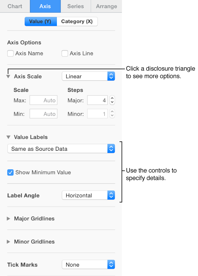
You can specify which labels appear on an axis, edit their names, and change their angle of orientation.
Select the chart.
Click the Axis tab at the top of the sidebar on the right.
If you don’t see the sidebar, or it doesn’t have an Axis tab, click ![]() in the toolbar.
in the toolbar.
Do either of the following:
Modify markings on the value axis: Click the Value (Y) button at the top of the sidebar.
Modify markings on the category axis: Click the Category (X) button at the top of the sidebar.
Use the controls in the sidebar to make adjustments.
To see all options, click the disclosure triangles to the left of the section headings.
If you turned on Axis Name and want to change the placeholder axis name, select the chart, double-click the name on the chart, then type your own.
Note: Y-axis options may be different for scatter and bubble charts.
You can specify whether to show chart grid lines and modify their appearance.
Click anywhere on the chart to select it.
Click the Axis tab at the top of the sidebar on the right, then click the button for the axis you want to modify (x or y).
If you don’t see a sidebar, or it doesn’t have an Axis tab, click ![]() in the toolbar.
in the toolbar.
Do any of the following:
Set the line type: Click the pop-up menu below Major Gridlines or Minor Gridlines, then choose a line type.
Set the line color: In the Major Gridlines section, click the color well or color wheel, then choose a color.
Set the increment for major gridlines: In the Major Gridlines section, click the arrows to the right of the increment field, or type a value in it.
Show tick marks for the x or value axis: Click the Tick Marks pop-up menu, then choose a location.
Click anywhere on the chart to select it.
Click the Chart tab at the top of the sidebar on the right.
If you don’t see the sidebar, click ![]() in the toolbar.
in the toolbar.
In the Chart Options section, select the Legend checkbox.
Click the chart, click the legend (to select only the legend), then do any of the following:
Change the appearance of the legend text: Click the Style tab at the top of the sidebar, then use the controls to add a background fill, add a border, and more.
Resize the legend: Drag the handles around the legend.