Text Controls in the Style Pane
This section describes the parameters in the Style pane of the Text Inspector, which include the Face, Outline, Glow, and Drop Shadow groups. Some parameter groups remain hidden until you expand them by clicking the Hide/Show icon to the right of the group header.
Click the Hide/Show icon on the right side of the group header row. (The icon is hidden until you move the pointer over it.)
Click the reset button on the right side of the group header row.
Note: Resetting parameter groups does not affect the activation checkbox for the group.
Text Face Controls in the Style Pane
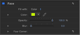
Use the Face parameter controls to specify whether text is a solid color, a color gradient, or a texture. Nearly all Face parameters can be animated.
Note: You can distort the fill of text independently of other style parameters. For more information, see Adjusting Glyph Attributes.
- Preset: Use this pop-up menu above the Face controls to save the format, style, or format and style of the text to the Library, or to apply a preset text style from the Library to the text. The default menu item is Normal.
For more information on applying and saving text styles, see Using and Creating Preset Text Styles.
- Color/Gradient/Texture: Use these color controls to set the text fill color, gradient, or texture, depending on which item is selected in the “Fill with” pop-up menu. Click the disclosure triangle to adjust additional parameters.
For information on editing text color, see Changing the Text Color. For more information on applying a gradient to text, see Applying a Gradient to Text. For more information on using textures, see Text Texture-Related Tasks.
- Opacity: Use this slider to set the text opacity of text, regardless of the fill option (Color, Gradient, or Texture).
For more information on changing text opacity, see Changing Text Opacity.
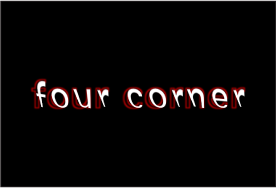
- Four Corner: Use these value sliders to control the position of the face attribute and distort the text characters. In the following illustration, the Four Corner parameter in the Face controls has been modified (but the Four Corner parameter for the red outline has not been modified).
Click the disclosure triangle to reveal the following value sliders:
Texture Subparameters in the Style Pane
When you choose Texture from the “Fill with” pop-up menu, additional parameters appear in the Face group. Use these controls to apply a texture (an image, movie, shape, object, or group) as the fill for text.
For information on using Texture controls, see Text Texture-Related Tasks.

Texture parameters respect filters applied to the source image but ignore transforms applied to the image. For example, if the image used as the source texture has a glow filter applied, the glow appears in the text’s texture. However, if the image used as the source texture is scaled or moved, or if the image contains applied behaviors, the result of these transforms does not appear in the applied texture.
Texture controls allow you to adjust subparameters. If you use an image sequence or movie as the text’s texture source, you can specify the start frame for the texture, or hold a single frame for the texture. You can also adjust the position of a texture that is applied to text so it is offset in the text but not repositioned in your project. If an image used as a texture is cut off, you can specify the edge behavior of the texture.
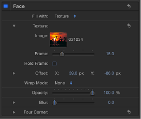
When “Fill with” is set to Texture, the following Texture parameters become available (open the disclosure triangle to see them):
- Wrap Mode: Use this pop-up menu to specify how the edge of a texture is treated when the texture is offset and appears cut off in the text, or when it is too small to fill the text it is applied to. There are three options:
- None: The texture remains transparent beyond the edge of the source image. This is the default mode.
- Repeat: The texture source is repeated beyond the edge of the source image.
- Mirror: Beyond the edge of the source image, the texture source is reflected like in a mirror—duplicated, tiled, and reversed to encompass the full width and height of the text.
Text Outline Controls in the Style Pane
Use the Outline group of controls to create text outlines. You can change the fill of the outline, as well as its opacity, softness, width, and layer order. Except for Layer Order, all Outline parameters can be animated.
Note: You can distort the outline of text independently of other style parameters. For more information, see Adjusting Glyph Attributes.
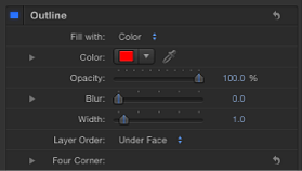
- Four Corner: Use these value sliders to control the position of the outline attribute, allowing for outline distorting effects. Click the disclosure triangle to reveal the value sliders:
- Bottom Right: Offsets the text outline from the lower right of its original position. Enter a value in the left value slider to offset the text fill in X space; enter a value in the right value slider to offset the text fill in Y space. Click the disclosure triangle to access X and Y position values.
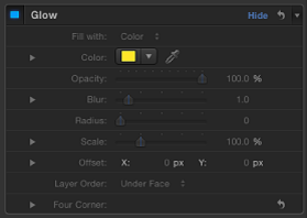
Text Glow Controls in the Style Pane
Use the Glow group of controls to create a glow in front of or behind text. Except for Layer Order, all Glow parameters can be animated.
When the Glow activation checkbox is selected, the text is rasterized. For more information, see About Rasterization.
Note: You can distort the glow of text independently of other style parameters. For more information, see Adjusting Glyph Attributes.
Text Drop Shadow Controls in the Style Pane
Use the Drop Shadow controls to create a drop shadow on text, and to adjust the shadow color, opacity, offset from the text object, softness, and angle. All Drop Shadow parameters can be animated.
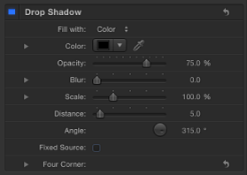
- Drop Shadow: Use this activation checkbox to enable or disable the drop shadow effect. Drop Shadow is deselected by default.
Note: When the Flatten checkbox is selected in the Layout pane of the Text Inspector, additional Drop Shadow controls appear in the Properties Inspector. Drop Shadow controls in the Properties Inspector are independent of the controls in the Text Inspector. Enabling Drop Shadow in both locations adds to the existing shadow.
- Four Corner: Use these value sliders to control the position of the drop shadow attribute. This allows for outline distorting effects. Click the disclosure triangle to reveal the value sliders:
- Bottom Left: Offsets the text drop shadow from the lower left of its original position. Enter a value in the left value slider to offset the text fill in X space; enter a value in the right value slider to offset the text fill in Y space. Click the disclosure triangle to access X and Y position values.
- Bottom Right: Offsets the text drop shadow from the lower right of its original position. Enter a value in the left value slider to offset the text fill in X space; enter a value in the right value slider to offset the text fill in Y space. Click the disclosure triangle to access X and Y position values.
- Top Right: Offsets the text drop shadow from the upper right of its original position. Enter a value in the left value slider to offset the text fill in X space; enter a value in the right value slider to offset the text fill in Y space. Click the disclosure triangle to access X and Y position values.
- Top Left: Offsets the text drop shadow from the upper left of its original position. Enter a value in the left value slider to offset the text fill in X space; enter a value in the right value slider to offset the text fill in Y space. Click the disclosure triangle to access X and Y position values.