
A data series (data set) is a set of related values in a chart—for example, all the bars of the same color in a bar chart, or a single line in a line chart.
You can emphasize trends in your chart by changing the appearance, position, or spacing of one or more of the data series.
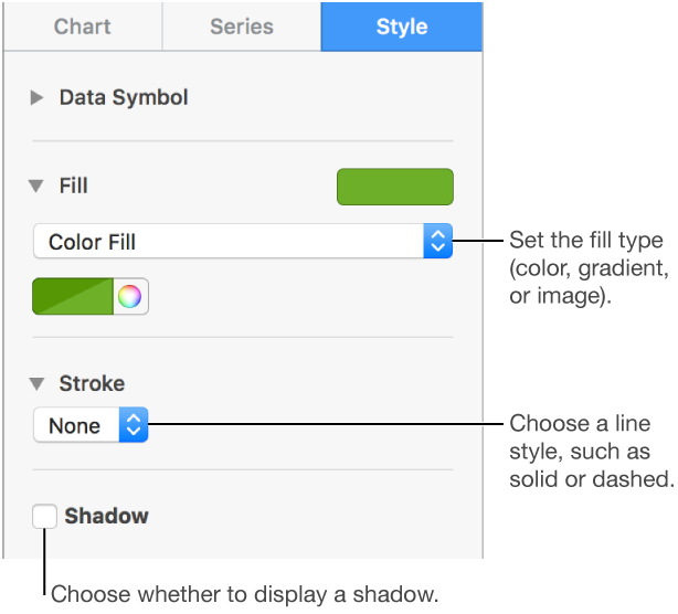
You can change the look of any data series in a chart to differentiate it from other series. For bar charts, for example, you can fill the bars in different series with a different color or a color gradient, apply a different outline (stroke) style, and more. For scatter charts, you can change the symbol that represents each point and add connection lines between the points.
Note: You can't change the look of a single data point in a series (a single bar in a bar chart, for example). All changes you make apply to every data point in the series.
Click the chart, then click one element of a data series (for example, one bar or column, pie wedge, or scatter point).
The entire data series is selected.
In the Format ![]() sidebar, click the Style tab.
sidebar, click the Style tab.
Use the controls in the sidebar to make changes; to see all options, you may need to click the disclosure triangle next to the name of each section.
The changes affect only the selected data series. To change another series, click one of its elements, then make changes.
To select multiple series, click a series element, then Command-click an element in another series. To select all series, click a series element, then press Command-A.
Tip: You can choose a coordinated set of colors for all the data series in the chart at once. Click the chart, click the Chart tab in the sidebar, then click ![]() and select colors. To preview the colors in your chart, hold the pointer over a color combination.
and select colors. To preview the colors in your chart, hold the pointer over a color combination.
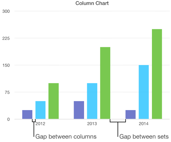
You can set the amount of space between the columns or bars in a column or bar chart.
Click the chart, then in the Format ![]() sidebar, click the Chart tab.
sidebar, click the Chart tab.
Click the disclosure triangle next to Gaps, then click the arrows to set the desired amount of space.
Select the pie or donut chart.
Do one of the following:
Move only selected wedges or segments: Double-click the wedge or segment, or Command-click multiple items, then drag.
Move all wedges in a pie chart: In the Format ![]() sidebar, click the Wedges tab. Click the disclosure triangle next to Wedge Position, then drag the Distance from Center slider to separate the wedges.
sidebar, click the Wedges tab. Click the disclosure triangle next to Wedge Position, then drag the Distance from Center slider to separate the wedges.
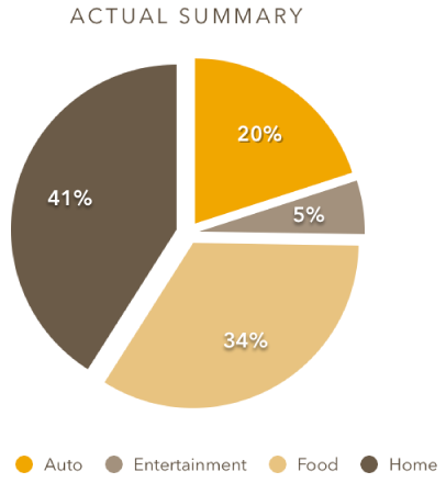
You can also move the Rotation Angle control to change the orientation of pie wedges or donut segments. You may want to emphasize some data, for example, by positioning certain wedges at the top or bottom of the chart.
You can change the chart depth, lighting style, bar shape, bevels, and rotation of 3D charts.
Click the 3D chart to select it, then in the Format ![]() sidebar, click the Chart tab.
sidebar, click the Chart tab.
Click the disclosure triangle next to 3D Scene, then use the controls to make adjustments.
You can increase the distinction between series in 3D stacked bar or column charts and 3D pie charts by beveling the edges where the series meet.
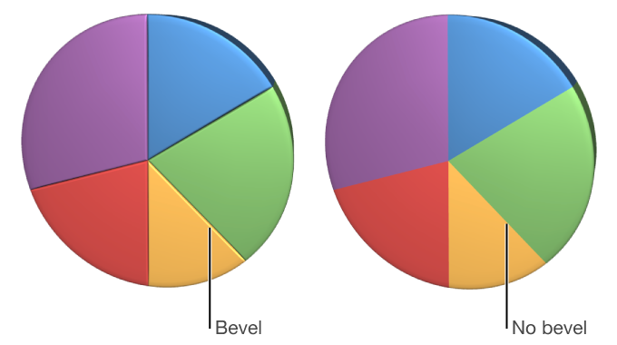
Click the chart, then in the Format ![]() sidebar, click the Chart tab.
sidebar, click the Chart tab.
Click the disclosure triangle next to 3D Scene, then select the Show Bevels checkbox.
Select the donut chart, then, in the Format ![]() sidebar, click the Segments tab. In the Inner Radius section of the sidebar, drag the slider or type a specific value.
sidebar, click the Segments tab. In the Inner Radius section of the sidebar, drag the slider or type a specific value.
You can save a chart’s look as a new style.
If you can’t edit a chart, you may need to unlock it.