
You can customize the look of a chart and create a new style from the customized chart. You can also create a new chart style that reflects the colors in a favorite image. The new styles are saved along with the styles that come with the template, and you can apply them to other charts.
The thumbnail images at the top of the Chart tab in the sidebar represent predesigned chart styles that are specifically made to look good with the template you’re using. You can apply a different style to a chart at any time.
Click the chart that has the formatting you want to save as a new style.
In the Format ![]() sidebar, click the Chart tab.
sidebar, click the Chart tab.
Click the triangle to the right of the chart styles to go to the last group of styles.
Click ![]() to add your style.
to add your style.
In the dialog that appears, choose an option:
All series styles: Keep all available series styles associated with the chart.
Only visible series styles: Keep only the series styles currently visible in the chart.
Click OK.
Your new chart style is added to the chart styles at the top of the sidebar. You can drag styles to organize them however you like, or replace them.
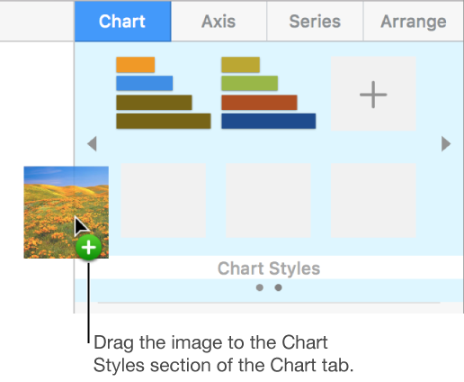
You can create a new chart style that matches the colors of a particular image. This can be helpful when you want to make a visual connection between the data shown in the chart and the subject of the image.
The new style is based on the type of chart currently showing in the sidebar, but it uses the colors of the image from which it was created.
Click a chart, or click ![]() in the toolbar to add a chart.
in the toolbar to add a chart.
In the Format ![]() sidebar, click the Chart tab.
sidebar, click the Chart tab.
Choose an image with colors you like from anywhere on your computer.
To browse your photos, click ![]() in the toolbar.
in the toolbar.
Drag the image to the chart styles in the sidebar.
Alternatively, you can Control-click a chart style, choose Create Style from Image from the shortcut menu, then browse for an image.
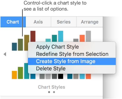
The new chart style is added to the chart styles at the top of the sidebar. The new style doesn’t replace the style you Control-clicked.
To apply the new style to the selected chart, click the style in the sidebar.
You can modify the look of a chart—by changing its fonts, colors, and so on—then update that chart’s style to incorporate the changes. Any other charts using that style are also updated.
Click a chart that uses the style you want to update, then modify its appearance so it looks the way you want.
Click the chart you just modified (if you deselected it).
In the Format ![]() sidebar, click the Chart tab.
sidebar, click the Chart tab.
Control-click the style, then choose Redefine Style from Selection.
If your chart has fewer than six data series, a dialog appears. Choose an option:
All series styles: Keep all available series styles associated with the chart.
Only visible series styles: Keep only the series styles currently visible in the chart.
Click OK.
The style is updated in the sidebar, and all charts that use the style are updated.
You can change the order of the chart styles at the top of the sidebar, or delete any style.
Click any chart, then in the Format ![]() sidebar, click the Chart tab.
sidebar, click the Chart tab.
Click and hold the style you want to move until it flashes.
Drag the style to a new location.
To move a style from one group to another, drag it over the gray arrow to the left ![]() or right
or right ![]() of the styles to open another group, then drag the style to where you want it.
of the styles to open another group, then drag the style to where you want it.
Control-click the style, then choose Delete Style.