Color Correction Filters
Color correction filters can be used in a number of ways. For example, you can change a mood by making an image sepia colored, or you can make your object stand out by oversaturating it. In addition, these filters can fix a problem with contrast, color, gamma, or brightness.
Brightness
Boosts or lowers the uniform brightness of an image by a specified amount.
Although this may seem to be the first filter to use to correct for improper exposure in an image, Brightness boosts or lowers everything in an image at once. This means that raising the brightness in an image raises brightness everywhere, including in the shadows. Consequently, a brightened image can look washed out.
However, this filter is useful for modifying the edges and effects of shapes, masks, particle systems, and generators.
A better filter for exposure correction is the Gamma filter. For more information, see Gamma.
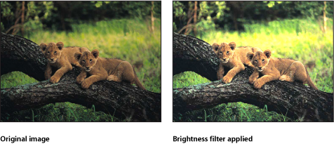
The HUD contains the following control: Brightness.
Channel Mixer
Allows cross-mixing of red, green, blue, and alpha channels into one another. The Channel Mixer filter’s main parameters are divided into four sections—Red Output, Green Output, Blue Output, and Alpha Output—each of which manipulates an individual channel. In each section, you can adjust the value of the relevant color channel added to or subtracted from the red, green, blue, and alpha channels.
- Alpha - Alpha: Sets the amount of input alpha added to the output alpha channel. The default value is 1.0, which leaves the alpha channel unmodified. As this value increases, more alpha is added to the pixels in the alpha channel. Values above 1 have no effect, unless the alpha is eroded by negative values in other alpha parameters.
- Allow Mono > 1: Allows monochromatic color channels to be set to values greater than 1. By default, this checkbox is selected. Color values are normally between 0 and 1, but can go over 1 or below 0 because the project’s bit depth is set to 16 bits per channel. If this checkbox is deselected, each Red color output control is linked. Moving any of them causes the others to adjust so the total value remains at 1.0. The filter must be in monochrome mode for this parameter to be active.
The HUD contains the following controls: Red - Red, Red - Green, Red - Blue, Red - Alpha, Green - Red, Green - Green, Green - Blue, Green - Alpha, Blue - Red, Blue - Green, Blue - Blue, Blue - Alpha, Alpha - Red, Alpha - Green, Alpha - Blue, Alpha - Alpha, Monochrome, Allow Mono > 1, and Include Alpha.
Color Balance
Color balance refers to the relative strength of the red, green, and blue channels that constitute an image. For example, a blue-tinted image has a strong blue channel and weaker green and red channels.
The Color Balance filter lets you adjust the relative balance of all three color channels of an image at once—for example, lowering the blue channel and raising the red and green channels to reduce blue tinting and yield an image that appears more orange and warm.
Color balance also relates to color temperature, which describes the quality of light in an image. For example, sunlight is generally more bluish than tungsten light, which is more orange. In professional film and video productions, white-balancing the camera before shooting usually ensures that whites in an image are neutral (with all three color channels balanced evenly). However, film stocks, optical filters, and digital white-balance settings can modify the tint of an image.
Note: The imbalanced color channels caused by a dominant color temperature in the lighting of an image is often referred to as a color cast.
You can use the Color Balance filter to adjust the three color channels of an image to eliminate a color cast or introduce one. Here are some uses for the Color Balance filter:
To correct problems in lighting—for example, rebalancing an image that’s too orange to appear more neutral.
To match two images to one another—for example, matching the quality of light on an actor in a foreground green screen clip to the lighting in a background image.
To stylize the color of an image used in a creative composition—for example, creating a high-contrast, blue-tinted silhouette from the image of two actors dancing for a title sequence.
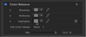
The Color Balance filter doesn’t just let you rebalance the overall strength of an image’s three color channels, it also lets you rebalance color specifically in three tonal zones of an image: shadows, midtones, and highlight. Three correspondingly named color controls let you make color balance adjustments in each zone of image tonality.
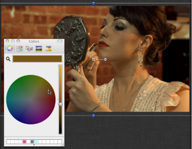
To make an adjustment to a zone, click the corresponding color well to open the Mac OS Colors window, then drag in the color wheel. As you drag, the image updates. Dragging in a specific hue’s direction rebalances the image, tinting it with that hue. The farther towards the edge of the color wheel you drag, the more intensely you tint the image.
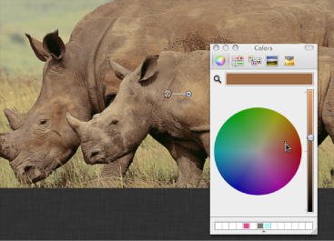
Tip: You can use any controls in the Mac OS X Colors window to make color adjustments, including sliders, web-safe colors, and the magnifying glass picker. Further, you can save frequently used tints by dragging a color from the color bar at the top to an empty white swatch below. Clicking a filled swatch selects that color.
The adjustments to shadows, midtones, and highlights of an image overlap widely. For example, adjustments to shadows affect the darkest parts of the image the most, but the effect also influences midtones and lower highlights. This overlap ensures that adjustments you make blend seamlessly with the original colors of the image.
For a practical example of using the Color Balance filter, see Matching Two Composited Layers Using the Color Balance Filter.
Note: Although you can make small contrast adjustments using the vertical lightness slider in the color wheel pane of the Colors window, it’s better to use the Contrast or Levels filters to make adjustments to the overall lightness and darkness of an image.
- Shadows: Adjusts color channels in the darkest regions of the image. Click the color well to open the Colors window, then adjust the color balance of the darkest portion of the image. An eyedropper lets you sample any color in the Canvas to use for balancing the image. You can also click the disclosure triangle to reveal individual red, green, and blue channel sliders, with a numeric range from 0 (no color) to 0.5 (unaltered color) to 1.0 (maximum color).
- Red: Adjusts the color gain applied to the shadow range of the red color channel.
- Green: Adjusts the color gain applied to the shadow range of the green color channel.
- Blue: Adjusts the color gain applied to the shadow range of the blue color channel.
- Midtones: Adjusts color channels in midtone regions of the image. Click the color well to open the Colors window, then adjust the color balance of the range of color falling between shadows and highlights. An eyedropper lets you sample any color in the Canvas to use for balancing the image. You can also click the disclosure triangle to reveal red, green, and blue channel sliders with a numeric range from 0 (no color) to 0.5 (unaltered color) to 1.0 (maximum color).
- Red: Adjusts the color gain applied to the midtone range of the red color channel.
- Green: Adjusts the color gain applied to the midtone range of the green color channel.
- Blue: Adjusts the color gain applied to the midtone range of the blue color channel.
- Highlights: Adjusts color channels in the lightest regions of the image. Click the color well to open the Colors window, then adjust the color balance of the brightest portion of the image. An eyedropper lets you sample any color in the Canvas to use for balancing the image. You can also click the disclosure triangle to reveal red, green, and blue channel slider with a numeric range from 0 (no color) to 0.5 (unaltered color) to 1.0 (maximum color).
- Red: Adjusts the color gain applied to the highlights of the red color channel.
- Green: Adjusts the color gain applied to the highlights of the green color channel.
- Blue: Adjusts the color gain applied to the highlights of the blue color channel.
The HUD contains the following controls: Shadows, Midtones, Highlights, and Clip Color Values.
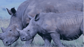
Matching Two Composited Layers Using the Color Balance Filter
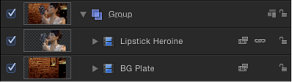
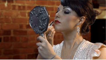
This example demonstrates how to use the Color Balance filter to match the color of a green-screened foreground image to a background plate. A green screen clip has been composited with a background layer using the Keyer filter. (For information about using the Keyer filter, see Using the Keyer Filter.) The background layer has already been modified with the Defocus and Contrast filters to appear moody and blurred (simulating a shallow depth of field).
Although the key is successful, the light illuminating the woman doesn’t quite match the light that illuminates the background.
You can fix this using the Color Balance filter.
Open the Library, click the Filters category, then click the Color Correction category to reveal the color correction filters in the stack.
Drag the Color Balance filter from the stack to the Layers list, onto the topmost layer of the composite (the keyed foreground layer).
Color Balance filter appears on top of the Keyer filter in the Layers list.
Open the Inspector.
The Color Balance filter appears at the top of the Filters inspector.
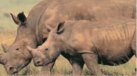
Click the Highlights color well.
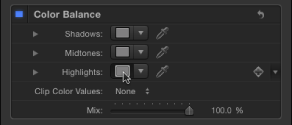
Highlights are often a good place to start when you need to match the color temperature of one image to another.
When the OS X Colors window appears, drag from the center of the color wheel toward orange, which is the predominant color of the background layer’s lighting.
As you drag in the color wheel, the color of highlights in the Canvas changes, with the color in the brightest highlights of the foreground image changing the most. Midtones are less affected, and shadows aren’t affected at all.
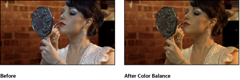
Stop adjusting when the color of the foreground layer’s highlights matches the color of similar highlights in the background.
Tip: You can also use the eyedropper tool in the Highlights color control to sample a highlight color in the background layer. (Click the eyedropper, then click a color in the background). This can be a simpler adjustment, but it can also be tricky to sample the best color for a natural-looking match.
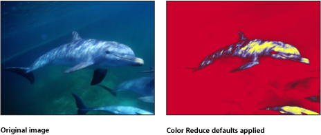
Color Reduce
Reduces the full range of color in an image to two, three, or four colors that you select. Depending on the number of substitute colors you choose in the Reduce To parameter, this filter breaks down the full range of colors in the image into a color range for each Match Color parameter that’s available. The filter then substitutes the selected Replace With color for each interpreted range of color.
If two colors are selected, color information in the object is reduced to the selected two colors; if three colors are selected, color information is reduced to three colors; and so on.
The HUD contains the following controls: Smoothness, Reduce To, Match Color 1, Replace With, Match Color 2, Replace With, Match Color 3, Replace With, Match Color 4, and Replace With.
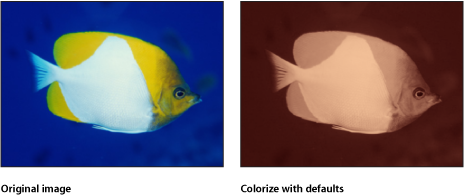
Colorize
Substitutes the blacks and whites in an image with colors you select. All other colors in the image are remapped to a duochrome range that falls between these two colors.
Interesting colorized negative effects can be achieved by remapping the blacks in an image to a lighter color than the whites.
The HUD contains the following controls: Remap Black To, Remap White To, and Intensity.
Contrast
Adjusts the difference between the lightest and darkest parts of an image.
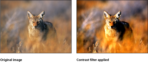
The HUD contains the following controls: Contrast, Pivot, and Clip Color Values.
Gamma
Adjusts the relative distribution of brightness in the midtones of an image, without adjusting the white and black points. The perceived result is to brighten and darken the areas of medium brightness in an image, while leaving the highlights and shadows untouched. This avoids a washed-out effect.
This is one of the most useful filters for correcting poor exposure in images, and should almost always be used first before trying the Brightness filter.
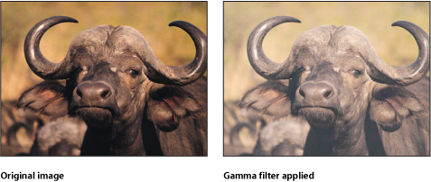
Tip: When opening projects created in earlier versions of Motion, previous gamma adjustments may be lost. Use the Gamma filter to reproduce the effect.
The HUD contains the following control: Gamma.
Gradient Colorize
Uses each pixel’s color value to determine the application of a color value from a gradient.
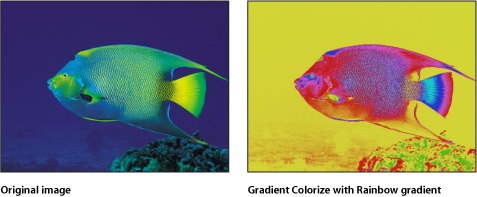
- Gradient: Selects a gradient preset to be applied to the object. Is also used to edit a custom gradient.
For more information on using the Gradient editor, see Using the Gradient Editor.
The HUD contains the following controls: Gradient, Offset, Repeats, Repeat Method, and Map Channel.
Hue/Saturation
This filter provides controls to adjust Hue, Saturation, and Value levels in an image. The Hue control is an angular representation of the color values in an image. By rotating the Hue angle, you uniformly remap the colors throughout an image, similar to the effect of turning the hue or phase knob of a broadcast monitor.
The Saturation slider controls the intensity of color in an image, with a high value resulting in vivid color, and a low value resulting in a grayscale image with no color at all. The Value slider adjusts the overall brightness or darkness of all colors in an image, including the blacks and whites in a desaturated image.
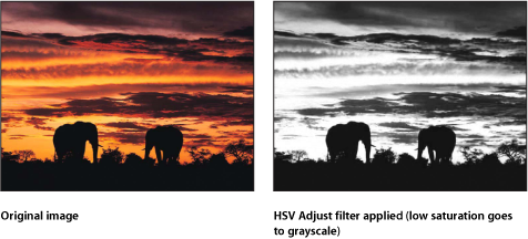
The HUD contains the following controls: Hue, Saturation, and Value.
Levels
Provides controls to remap the white and black points of an image, with a Gamma control to adjust midtones, all at once. A histogram provides an analysis of the image to help you judge the adjustments to make.
A powerful option in this filter is the ability to make independent adjustments to the red, green, blue, and alpha channels of an object.
- Histogram: Displays an analysis of the object. By default, the RGB channels are selected. A pop-up menu can be used to select Red, Green, Blue, or Alpha channels for viewing.
Click the disclosure triangles to expose the RGB, Red, Green, Blue, and Opacity parameter groups. Click the group parameter disclosure triangles to display sliders:
- Black In: Sets the In point for black, below which values are considered black.
- Black Out: Sets the minimum brightness value that appears in the output. Other values are scaled between Black Out and White Out values.
- White In: Sets the In point for white, above which values are not output.
- White Out: Sets the maximum brightness value that appears in the output. Other values are scaled between Black Out and White Out values.
- Gamma: Sets the amount of gamma correction.
None.
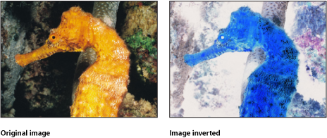
Negative
Inverts color and brightness in an image. This filter can be used to turn a scanned negative image into a positive.
None.
OpenEXR Tone Map
Applies tone mapping to an OpenEXR image, reducing the dynamic range of the image so that it can be viewed on your monitor. The Exposure, Defog, Knee Low, and Knee High parameters allow you to control how the pixels in the high-dynamic range image are mapped to a lower dynamic range.
Tip: A recommended workflow is to apply the OpenEXR Tone Map filter to the result of your composite. In other words, apply the OpenEXR Tone Map filter after you have applied other filters to the OpenEXR image or blended the image with other images in your project.
Note: An OpenEXR file imported into Motion 5.0.2 or later is maintained as a high-dynamic range image and will appear brighter than in earlier versions of Motion (until you specifically alter the image). Prior to version 5.0.2, Motion forced tone mapping on imported OpenEXR images. In Motion 5.0.2 or later, when you open an older project containing an OpenEXR image, an OpenEXR Tone Map filter is automatically applied to the image so that the project retains its original appearance.
The HUD contains the following controls: Exposure, Defog, Knee Low, and Knee High.
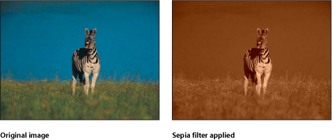
Sepia
Tints an object with a sepia tone. The black and white points are remapped to dark and light sepia colors. The amount of tinting can be adjusted to achieve a subtle mix of the original and tinted colors, or a completely tinted image.
This filter can create an old-time western look.
The HUD contains the following control: Amount.
Threshold
Reduces all colors in an image to a duotone, and optionally limits the range of midtones preserved in the image. The result is an extremely high-contrast image that defaults to black and white—but you can reduce the image to any two colors.
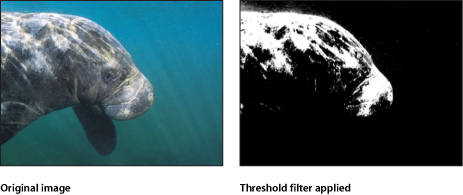
The HUD contains the following controls: Threshold, Smoothness, Dark Color, and Light Color.
Tint
Tints an image with a single color. Shadows and highlights are less affected, but all midrange colors in the image are gradually replaced with the tint color as the Intensity parameter is increased.
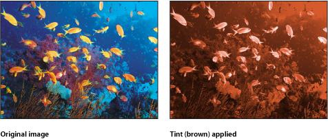
The HUD contains the following controls: Color and Intensity.
YIQ Adjust
Allows color adjustment in YIQ color space. The YIQ color space definition was formerly used to describe an NTSC broadcast signal.
The HUD contains the following controls: Y, I, and Q.