
A data series (data set) is a set of related values in a chart—for example, all the bars of the same color in a bar chart, or a single line in a line chart.
You can emphasize trends in your chart by changing the appearance, position, or spacing of one or more of the data series.
Tap the chart you want to change, tap ![]() , then tap Chart.
, then tap Chart.
Drag the Rounded Corners slider to adjust the roundedness of the bars or columns.
If you don’t see the Rounded Corners slider, swipe up from the bottom of the controls.
To round only the two outside corners of each bar or column (those farthest from the axis), turn on Outside Corners Only.
You can change the chart depth and the shape of columns or bars for a 3D chart.
Tap the chart, tap ![]() , then tap Chart.
, then tap Chart.
Swipe up to see the Depth slider (if you don’t see it), then do any of the following:
Adjust the depth: Drag the Depth slider to the right to make the chart appear deeper, or drag it to the left to make it appear less deep.
Change the shape of columns or bars: Tap Column Shape or Bar Shape, then tap either Rectangle or Cylinder.
You can increase the distinction between series in 3D stacked bar or column charts and 3D pie charts by beveling the edges where the series meet.
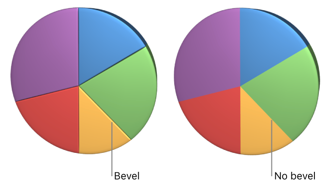
Tap the chart, then tap ![]() .
.
Tap Chart, then turn on Bevels.
The bevels control appears only when a 3D pie chart, 3D stacked bar chart, or 3D stacked column chart is selected.
If you don’t see Bevels, swipe up from the bottom of the controls.
Select the pie or donut chart.
Drag the wedge or segment away from the chart’s center.
You can drag the Rotation Angle slider to change the orientation of pie wedges or donut segments. You may want to emphasize some data, for example, by positioning certain wedges at the top or bottom of the chart.
Tap the donut chart, tap ![]() , then drag the Inner Radius slider to make the opening larger or smaller.
, then drag the Inner Radius slider to make the opening larger or smaller.
If you can’t edit a chart, you may need to unlock it.