
You can change the look of chart text by applying a different style to it, changing its font, adding a border, and more.
Tap the chart, tap ![]() , then tap Chart.
, then tap Chart.
Do any of the following:
Change the font: Tap Chart Font, then tap a font name.
If you don’t see Chart Font, swipe up from the bottom of the controls.
Change the font style: Tap Chart Font, tap ![]() next to the font name, then tap a style.
next to the font name, then tap a style.
Make the font smaller or larger: Tap ![]() or
or ![]() .
.
All text in the chart increases or decreases proportionally (by the same percentage).
Tap ![]() to close the controls.
to close the controls.
Charts have a placeholder title (Title) that’s hidden by default. You can show the chart title and change it.
Tap the chart, then tap ![]() .
.
Turn on Chart Title.
To change the alignment of the title—so that it’s on the left of the chart, for example—tap an alignment option.
To move the title to the center of a donut chart, tap Position, then tap Center.
To edit the title, select the text, type a new title, then tap Done.
Charts have labels that show the values of specific data points. You can show the value labels in a bar, column, area, scatter, pie, or donut chart, specify a format for them (for example, number, currency, or percentage), and change how they look.
Tap the chart, then tap ![]() .
.
Tap Chart.
Do one of the following:
For scatter charts: Tap Value Labels, then tap Values and choose an axis. To hide value labels, tap None.
For pie and donut charts: Tap Value Labels, turn on Values, then tap where you want the labels to appear. To hide value labels, turn off Values.
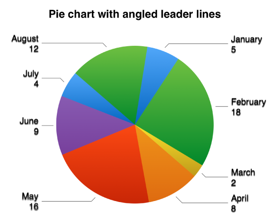
If you select Inside and turn on Prevent Overlap, labels may move to avoid overlapping, and leader lines may appear to connect the labels to their wedges or segments. If you select Outside, the labels move outside the wedges or segments. To connect the labels to their wedges or segments, tap either Straight or Angled to turn on leader lines; tap None if you don’t want leader lines. With angled leader lines, the callouts align into columns, as shown below.
For the other types of charts: Tap Value Labels, then tap where you want the labels to appear on the data series (for example, Top, Middle, Inside, Outside, or Center). To hide value labels, tap Off.
To modify the number format for the labels, tap Chart again, then tap Number Format, or, for scatter charts, tap Chart again, tap Value Labels, then tap Number Format.
Use the controls to make further adjustments to the labels:
Set the number of decimal places: Tap ![]() or
or ![]() .
.
Add a prefix or suffix: The text you enter for these is added to the beginning or end of the label.
Show the thousands separator: Turn on Separator.
Choose how to display negative numbers: Tap “–100” or “(100).”
Note: The font for the value labels changes when you change the font for the entire chart.
Tap the chart, tap ![]() , then tap Chart.
, then tap Chart.
Tap Bubble Options.
If you don’t see Bubble Options, swipe up from the bottom of the controls.
Turn on Series Names.
To show value labels, tap Values, tap an option, then tap Back.
To change the location of the label, tap Label Location, then tap an option.
If your chart has overlapping bubbles, you can choose to show only the label for the topmost bubble. Turn off Show Labels In Front.
If you don’t see Show Labels In Front, swipe up from the bottom of the controls.
To modify the number format for the labels, tap Bubble Options again, then tap Number Format (below Values).
Use the controls to make further adjustments to the labels:
Set the number of decimal places: Tap ![]() or
or ![]() .
.
Add a prefix or suffix: The text you enter for these is added to the beginning or end of the label.
Show the thousands separator: Turn on Separator.
Choose how to display negative numbers: Tap “–100” or “(100).”
You can specify which labels appear on an axis, edit their names, change their angle of orientation, set the range and frequency of the tick marks, and more.
Tap the chart, then tap ![]() .
.
Do any of the following:
Modify markings on the x-axis: Tap X Axis.
Modify markings on the y-axis: Tap Y Axis.
Use the controls to make any adjustments you want.
If you turn on Axis Name, Pages adds a placeholder axis name to the chart. To change it, select the axis name, then type your own.
Note: Y-axis options may be different for scatter charts and bubble charts.
To add a caption or label to a chart, see Create a caption for an image or other object.