
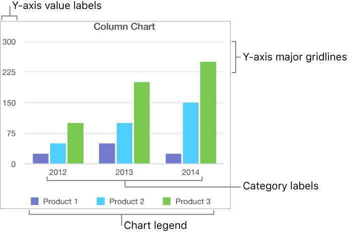
There are several types of chart markings and axis labels you can add to your charts. You can modify their look to emphasize your data, and you can style the chart title and value label text differently to make it stand out from the other text.
Tap the chart, then tap ![]() .
.
Tap Chart, then turn on Legend.
If you don’t see Legend, swipe up from the bottom of the controls.
To adjust the size of the legend, tap the legend, then drag the green dots.
Drag the legend to where you want it.
Tap the chart, tap ![]() , then tap X Axis or Y Axis.
, then tap X Axis or Y Axis.
Tap the controls to turn Major Gridlines, Minor Gridlines, or Major Tick Marks on or off (swipe up to see these controls if they aren’t visible).
These options vary depending on the type of chart and data.
You can add reference lines to a chart to mark the average, median, minimum, and maximum values. Reference lines make a chart easier to interpret at a glance and can help you compare the values in the chart to a benchmark value.
All chart types can have reference lines, except stacked charts, two-axis charts, 3D charts, pie charts, and donut charts. A chart can have up to five reference lines.
Tap the chart.
Tap ![]() , then tap the axis that shows the values in your chart—X Axis or Y Axis.
, then tap the axis that shows the values in your chart—X Axis or Y Axis.
Tap Add Reference Line, then tap any of the following:
Average: A line that runs through the mean value of the data
Median: A line that runs through the middle value of the data
Minimum: A line that runs through the lowest value
Maximum: A line that runs through the highest value
Custom: A line that runs through a value you enter in the Custom section
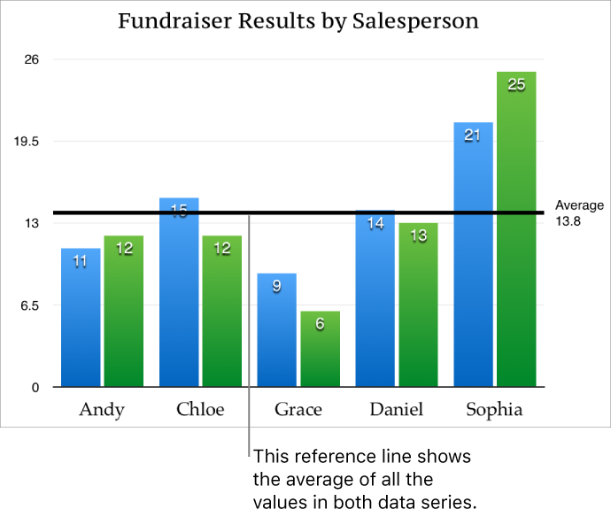
To clarify what the reference line represents, tap to turn on Show Name and Show Value.
To remove a reference line, tap the chart, tap ![]() , tap Reference Lines, tap the name of the reference line, then tap Remove Line.
, tap Reference Lines, tap the name of the reference line, then tap Remove Line.
Note: When you drag the slider on an interactive chart to view different data sets, its reference lines move.