
In Numbers, all charts are created using data from an existing table. To create any type of chart, you can add a chart to a sheet first, then select the table cells with the data you want to use. Or, you can select the data first, then create a chart that displays the data. Either way, when you change the data in the table, the chart updates automatically.
In Numbers, you can import a spreadsheet with charts from Microsoft Excel. The imported charts might look somewhat different from the original, but the data they display is the same.
Tip: You can learn about different chart types in the Charting Basics template. To open it, choose File > New (from the File menu at the top of your screen), click Basic in the left sidebar, then double-click the Charting Basics template. In Charting Basics, click the tabs near the top of the template to view the different sheets; each one explains a different type of chart.
Click ![]() in the toolbar, then click 2D, 3D, or Interactive.
in the toolbar, then click 2D, 3D, or Interactive.
Click the left and right arrows to see more styles.
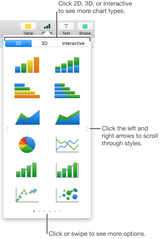
Note: The stacked bar, column, and area charts show two or more data series stacked together.
Click a chart or drag it to the sheet.
If you add a 3D chart, you see ![]() at its center. Drag this control at any time to adjust the chart’s orientation.
at its center. Drag this control at any time to adjust the chart’s orientation.
Click the Add Chart Data button near the selected chart (if you don’t see the Add Chart Data button, make sure the chart is selected).
Select the table cells with the data you want to use.
You can select cells from one or more tables, including tables on different sheets. While you’re editing a chart’s data references, ![]() appears on the tab for any sheet that contains data used in the chart.
appears on the tab for any sheet that contains data used in the chart.
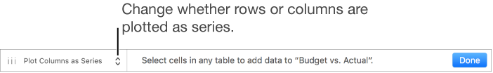
To change whether rows or columns are plotted as data series, choose an option from the pop-up menu in the bar at the bottom of the window.
Click Done in the bar at the bottom of the window.
You can change the data reflected in the chart at any time. To learn how, see Modify chart data references.
Select the table cells with the data you want to appear in the chart; to add data from an entire row or column, click the table, then click the number or letter for that row or column.
You can select cells from one or more tables, including tables on different sheets. While editing a chart’s data references, ![]() appears on the tab for any sheet that contains data used in the chart.
appears on the tab for any sheet that contains data used in the chart.
Click ![]() in the toolbar, then click 2D, 3D, or Interactive.
in the toolbar, then click 2D, 3D, or Interactive.
Click the left and right arrows to see more style options.
Click a chart or drag it to the sheet.
If you add a 3D chart, you see ![]() at its center. Drag this control at any time to adjust the chart’s orientation.
at its center. Drag this control at any time to adjust the chart’s orientation.
To change whether rows or columns are plotted as data series, click Edit Data References, then click the pop-up menu in the bar at the bottom of the window and choose an option.
Click Done in the bar at the bottom of the window.
You can adjust the data reflected in the chart at any time. To learn how, see Modify chart data references.