
Scatter charts show relationships between two or more sets of data. They display data as points and require at least two columns (or rows) of data to plot values for a single data series. By default, each data series in a scatter chart shares the x-axis value, and therefore, you need to add only one additional row or column to show another data series.
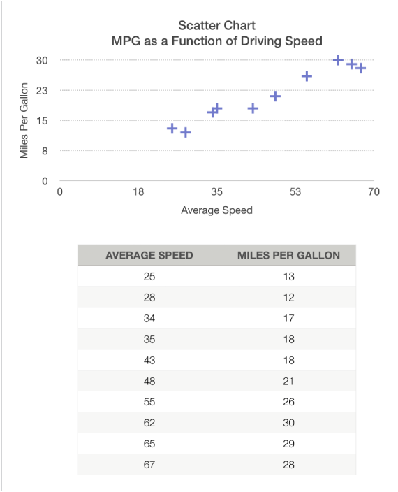
The scatter chart below shows the correlation between driving speed and gas mileage (miles per gallon).
A bubble chart is a type of scatter chart in which the data are plotted as bubbles of varying sizes, rather than as points. Each data series in a bubble chart includes a third dimension that conveys the relationship between the compared values (x and y) and a size value (z). The size value determines the size of the bubble.
By default, each data series in a bubble chart shares the x-axis value, so you need to add only two additional rows or columns of data to show another data series. If you choose to use independent x-axis values, you need to add three additional rows or columns (x, y, and z) to show another data series.
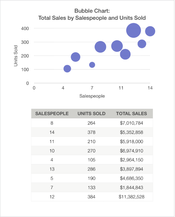
The bubble chart below shows how the number of units sold (y) varies with the number of salespeople (x). The data is plotted as bubbles of varying sizes—the larger the bubble, the higher the total sales amount (z).
To create these charts you can add a chart to a sheet first, then select the table cells with the data you want to use. Or, you can select the cells first, then create a chart that displays the data. Either way, when you change the data in the table, the chart updates automatically.
The topics below describe how to add a chart first, then select the data.
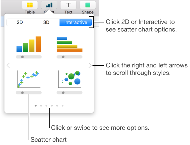
Click ![]() in the toolbar, then click 2D or Interactive (there are no 3D scatter charts).
in the toolbar, then click 2D or Interactive (there are no 3D scatter charts).
Click the left and right arrows to see more styles.
Click a scatter chart or drag one to the sheet.
Click the Add Chart Data button near the chart.
If you don’t see the Add Chart Data button, make sure the chart is selected.
Select the table rows or columns that have the data you want to use by clicking the numbers or letters for those rows or columns.
You can select rows or columns from one or more tables, including tables on different sheets.
If you select more than two columns: The first column selected determines the x-axis values, and each additional column selected creates a new series (and determines the y-axis values for that series).
If you select two columns: The scatter chart plots one data series. The first column selected determines the x-axis values, and the second column determines the y-axis values.
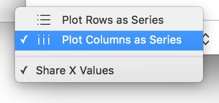
To have each series use a different column for the x-axis values, click the pop-up menu in the bar at the bottom of the window and choose Share X Values to remove the checkmark.
If you select only a single column: The scatter chart plots the data similar to a line chart, with the values from the selected column along the y-axis.
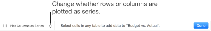
To change whether rows or columns are plotted as series, choose an option from the pop-up menu in the bar at the bottom of the window.
Click Done in the bar at the bottom of the window.
Click ![]() in the toolbar, click 2D or Interactive (there are no 3D bubble charts).
in the toolbar, click 2D or Interactive (there are no 3D bubble charts).
Click the right and left arrows to see more styles.
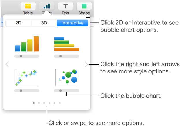
Click a bubble chart or drag one to the sheet.
Click Add Chart Data below the chart.
If you don’t see Add Chart Data, make sure the chart is selected.
Select the table rows or columns with the data you want to use by clicking the numbered or lettered bar for those rows or columns.
You can select rows or columns from one or more tables, including tables on different sheets.
Plot one data series: Select three columns. The first column selected determines the x-axis values, the second column determines the y-axis values, and the third column determines the size of the bubble.
Plot more than one data series: Select sets of three columns. The bubble chart plots each group of three columns as one data series. The first column selected determines the x-axis values, the second column determines the y-axis values, and the third column determines the sizes of the bubbles.
To have each bubble series share one column for the x-axis values, choose Share X Values from the pop-up menu in the bar at the bottom of the window. In this case, select sets of two columns for each additional data series.
Use data from a single column: Select the column. The bubble chart plots the data similar to a line chart, with the values from the selected column along the y-axis.
To change whether rows or columns are plotted as series, choose an option from the pop-up menu in the bar at the bottom of the window.
Click Done in the bar at the bottom of the window.
Sharing the x-axis means plotting a single kind of value along the x-axis, while allowing for multiple kinds of values to be plotted along the y-axis. By default, the x-axis values are shared among multiple sets of y-axis values in some types of charts.
Click the chart, then click the Edit Data References button.
Click the pop-up menu in the bar at the bottom of the window and choose Share X Values to add or remove the checkmark.
You see a checkmark when x-axis values are shared.
Click Done in the bar at the bottom of the window.
You can change the data reflected in the chart at any time. To learn how, see Modify chart data references.