Change a chart’s appearance

You can change the appearance of a chart by applying a different style, changing the font, adding a border, and more.

Apply a different style to a chart

The thumbnail images at the top of the Chart pane represent predesigned chart styles that are specifically made to look good with the template you’re using. You can apply a different style to a chart at any time.

    If you can’t edit a chart, it may be locked. Unlock it to make changes.

    To save a chart’s appearance as a new style, go to Save a chart as a new style.

    Change the appearance of chart text

    When you can change the appearance of chart text using the controls in the Chart pane of the Format inspector, all text in the chart is changed. However, you can still change the chart title and value label text so they look different from the other text by using the controls in the Chart Title and Value Labels pane, respectively.

    1. Select the chart.

    2. In the Chart pane of the Format inspector, do any of the following:

      • Change the font: Choose a font from the Chart Font pop-up menu.

      • Change the typeface: Choose an option from the pop-up menu below the font name.

      • Make the font smaller or larger: Click the small A or the large A.

        All text in the chart increases or decreases proportionally (by the same percentage).

    Change the appearance of chart series

    You can change the appearance of individual data series in a chart. Depending on chart type, you can change the fill type and color, outline (stroke) style, and more. For scatter charts, you can change the symbol that represents each point and add connection lines.

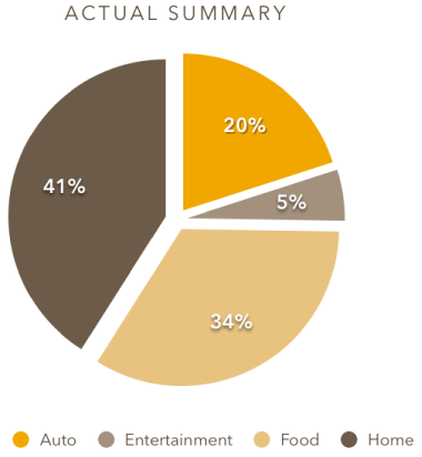
    1. Select the chart, then click one element of a data series (one bar or column, pie wedge, or scatter point, for example).

      The entire data series is selected.

    2. In the Style pane of the Format inspector, use the controls to make changes.

      To see all options, you may need to click the disclosure triangle next to the name of each section.

      Controls for changing appearance of data series

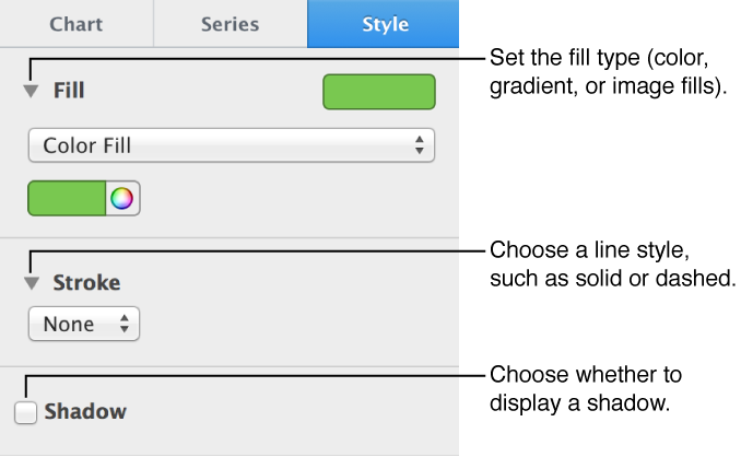
      To change the colors of the data series, click the chart colors button. Hover over a color combination to preview what it looks like.

    The changes affect only the selected data series. To modify the appearance of other series, select an element from a different series, then make changes.

    Change the spacing of elements in bar or column charts

    For a bar or column chart, you can set the amount of space between the columns or bars.

    Change the position of pie chart wedges

    1. Select the chart.

    2. Select a wedge, then drag it.

      Pie chart with wedges separated

    To change the position of all the wedges at the same time, select the chart, then in the Wedges pane of the Format inspector, click the disclosure triangle next to Position. Drag the Distance from Center slider to separate the wedges.

    Add a border around a chart

    You can add a border to any 2D bar, column, area, or scatter chart.

    1. Select the chart.

    2. In the Chart pane of the Format inspector, select the Border checkbox in the Chart Options section.

    3. To change the border’s appearance, click the disclosure triangle next to Background & Border Style, then use the controls to make changes.

    Change the depth of a 3D chart and the shape of series elements

    1. Select the chart.

    2. In the Chart pane of the Format inspector, click the disclosure triangle next to 3D Scene.

    3. Use the controls in the 3D Scene section to make adjustments.

    Bevel the edges between series or wedges in 3D stacked or pie charts

    You can increase the distinction between series in 3D stacked bar or column charts and 3D pie charts by beveling the edges where the series meet.

    1. Select the chart.

    2. In the Chart pane of the Format inspector, click the disclosure triangle next to 3D Scene.

    3. Select the Show Bevels checkbox.

    See also
    Change a chart from one type to another