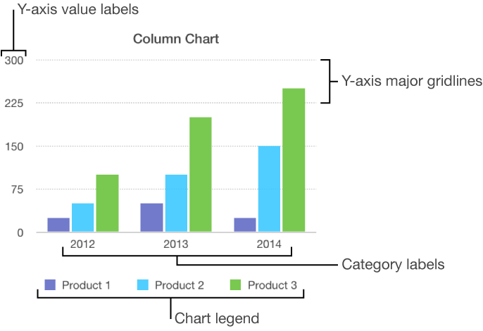
There are several types of chart markings and axis labels you can add to your charts. You can modify their look to emphasize your data.
Charts have a placeholder title (Title) that’s hidden by default. You can show and rename the chart title.
Click the chart to select it.
Click the Chart tab at the top of the sidebar on the right.
If you don’t see a sidebar, or the sidebar doesn’t have a Chart tab, click ![]() in the toolbar.
in the toolbar.
Select the Title checkbox.
Double-click the placeholder title, then type your own.
To change the look of the title, such as its font, size, and color, double-click the title again, then use the controls in the Chart Font section of the sidebar to make changes.
Charts have labels that show the values of specific data points. By default, these value labels are hidden for new charts, but you can make them visible and specify a format (for example, number, currency, or percentage), change their font and color, and more.
Click the chart to select it.
Click the Series tab at the top of the sidebar on the right, or for a pie chart, click the Wedges tab.
If you don’t see a sidebar, or the sidebar doesn’t have a Series (or Wedges) tab, click ![]() in the toolbar.
in the toolbar.
Note: Depending on the type of chart, the controls for setting value labels may be different. For example, an interactive bubble chart has a Bubble Labels section. For scatter charts, you choose an axis, then select Show Series Name.
Click the disclosure triangle next to Value Labels, select the Values checkbox (if there is one) then click the pop-up menu and choose a number format.
Some chart types have other controls you can use to make further adjustments to the labels.
Set the number of decimal places: Click the up or down arrow.
Add a prefix or suffix: The text you enter is added to the beginning or end of the label.
Specify where numbers appear: Choose an option from the Location pop-up menu.
Show the thousands separator: Select the Thousands Separator checkbox.
To change the font, color, and style of the labels, click any value label on the chart.
All value labels for that series are selected.
Use the controls in the Font section of the sidebar to make changes.
Only the labels for the selected data series are modified. To change labels for another series, click one of its labels, then make changes.
To select multiple series, select a series, then Command-click another. To select all series, select one, then press Command-A.
If you change the font for the entire chart, it also changes the font for the value labels.
Click the chart to select it.
To make changes for only one wedge, click the wedge.
Click the Wedges tab at the top of the sidebar on the right.
If you don’t see a sidebar, or the sidebar doesn’t have a Wedges tab, click ![]() in the toolbar.
in the toolbar.
Click the disclosure triangle next to Labels, then do any of the following:
Show data point labels: Select the Data Point Names checkbox.
Show data values: Select the Values checkbox.
Change the number format: Click the Value Data Format pop-up menu, then choose a format.
Use the other controls to make further adjustments to the labels:
Add a prefix or suffix: Anything you enter is appended or prepended to the label.
Change the position of the labels: Drag the Distance from Center slider to specify where the numbers appear.
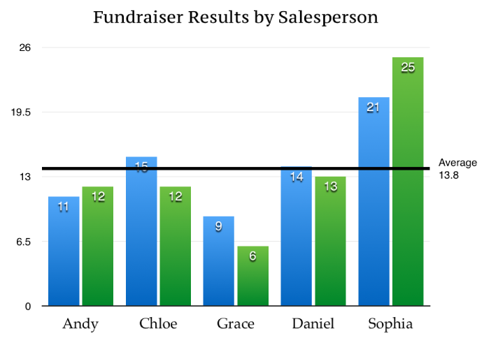
You can add reference lines to a chart to mark the average, median, minimum, and maximum values. Reference lines make a chart easier to interpret at a glance and can help you compare the values in the chart to a benchmark value.
A chart can have up to five reference lines. All chart types can have reference lines, except stacked charts, 2-axis charts, 3D charts, and pie charts.
Click the chart to select it.
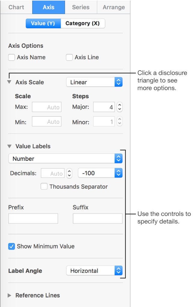
Click the Axis tab at the top of the sidebar on the right, then click the Value button near the top of the sidebar.
If you don’t see a sidebar, or the sidebar doesn’t have an Axis tab, click ![]() in the toolbar.
in the toolbar.
Click the disclosure triangle next to Reference Lines, then choose any of the following types of reference lines from the pop-up menu:
Average: A line that runs through the mean value of the data
Median: A line that runs through the middle value of the data
Minimum: A line that runs through the lowest value
Maximum: A line that runs through the highest value
Custom: A line that runs through a value you specify
To show what the reference line represents, select the Show Name and Show Value checkboxes.
To change the settings for a reference line, click the line, then use the controls in the Reference Line tab in the sidebar on the right.
Note: When you drag the slider on an interactive chart to view different data sets, its reference lines move.
To remove a reference line, click the line to select it, then press Delete on your keyboard.
Error bars give a general impression of your data’s accuracy. They are represented as small marks whose length indicates the amount of uncertainty associated with a given data series (the data’s variability). You can add them to 2D line charts, area charts, bar and column charts, stacked bar and column charts, bubble charts, and scatter charts.
Click the chart to select it.
Click the Series tab at the top of the sidebar on the right.
If you don’t see a sidebar, or the sidebar doesn’t have a Series tab, click ![]() in the toolbar.
in the toolbar.
Click the disclosure triangle next to Error Bars, click the pop-up menu, then choose a type of error bar.
Click the second pop-up menu, choose how error values are calculated, and change the range if you want.
To change the look of the error bars, click an error bar so that you see white dots at either end, and the Error Bar tab appears at the top of the sidebar on the right.
All error bars for elements in the same series are selected.
Use the controls in the Bar Style and Shadow sections to make changes.
Repeat steps 4 and 5 to change the look of the error bars for other series.
To remove error bars, click to select the chart, click the Error Bars pop-up menu, then choose None.
Trendlines show you the overall direction (or trend) of your data. Trendlines are mostly used for making financial investment decisions and appear in bar, line, scatter, and bubble charts.
Click the chart to select it.
Click the Series tab at the top of the sidebar on the right.
If you don’t see a sidebar, or the sidebar doesn’t have a Series tab, click ![]() in the toolbar.
in the toolbar.
Click the disclosure triangle next to Trendlines, click the pop-up menu, then choose a type of trendline.
Do one of the following:
Show names for the trendlines: Select the Name checkbox, then type a name in the field. The name you type appears for all trendlines on the chart. To change a name, double-click it on the chart, then type a new one.
Show the equation or coefficient of determination: Select the Show Equation or Select R2 Value checkbox.
To change the look of a trendline, click the line so you see white dots at either end, and the Trendline controls appear in the sidebar.
If you don’t see a sidebar, or the sidebar doesn’t have a Trendline tab, click ![]() in the toolbar.
in the toolbar.
Use the controls in the Stroke and Shadow sections to make changes.
To remove trendlines, click to select the chart, click the Trendlines pop-up menu, then choose None.
Note: On iOS devices, trendlines are visible in charts that already have them. You can’t add trendlines in charts you create on an iOS device.
You can specify which labels appear on an axis, edit their names, and change their angle of orientation.
Click the chart to select it, then click the Axis tab at the top of the sidebar on the right.
If you don’t see a sidebar, or the sidebar doesn’t have an Axis tab, click ![]() in the toolbar.
in the toolbar.
Do one of the following:
Modify markings on the value axis: Click the Value (Y) button at the top of the sidebar.
Modify markings on the category axis: Click the Category (X) button at the top of the sidebar.
Use the controls to make adjustments.
To see all options, click the disclosure triangles to the left of the section headings.
If you selected the Axis Name checkbox and want to change the name on the chart, click the chart, double-click the axis name on the chart, then type your own.
Note: Y-axis options may be different for scatter and bubble charts.
To change the font, color, and style of axis labels, click an axis label, then use the controls in the Font section of the sidebar to make changes.
You can specify whether to show chart gridlines, and you can modify their look.
Click the chart to select it.
Click the Axis tab at the top of the sidebar on the right, then click the button for the axis you want to modify (x or y).
If you don’t see a sidebar, or the sidebar doesn’t have an Axis tab, click ![]() in the toolbar.
in the toolbar.
Do any of the following:
Set the line type: Click the disclosure triangle next to Gridlines (for the x axis), or Major Gridlines or Minor Gridlines (for the y axis), then click the pop-up menu and choose a line type.
Set the line color: In the Major Gridlines section, click the color well or color wheel, then choose a color.
Set the increment for major gridlines: In the Major Gridlines section, click the arrows to the right of the increment field, or type a value in it.
Show tick marks for the x or value axis: Click the Tick Marks pop-up menu, then choose a location.
Click the chart to select it.
Click the Chart tab at the top of the sidebar on the right.
If you don’t see a sidebar, click ![]() in the toolbar.
in the toolbar.
In the Chart Options section, select the Legend checkbox.
In your presentation, click the legend to select it, then do any of the following:
Change the look of the legend text: Click the Style tab at the top of the sidebar, then use the controls to add a background fill, add a border, and more.
Resize the legend: Drag the handles around the legend.
Drag the legend to where you want it.
You can position the legend more precisely by selecting it, then pressing the arrow keys. Pressing Shift-arrow moves the legend in larger steps.