You can display your data using 2D, 3D, and interactive charts.
When you create a chart, you first select a chart type, and then you enter data for the chart in the Chart Data Editor. When you make changes in the Chart Data Editor, the chart updates automatically.
Create a column, bar, line, area, or pie chart
Click in the toolbar, then click 2D, 3D, or Interactive.
Click the left and right arrows to see more style options.
Select a chart or drag one to the slide.
If you add a 3D chart, you see at its center. Drag this control at any time to adjust the chart’s orientation.
To add your data, click the chart, click the Edit Chart Data button near the chart, then enter your data in the Chart Data editor.
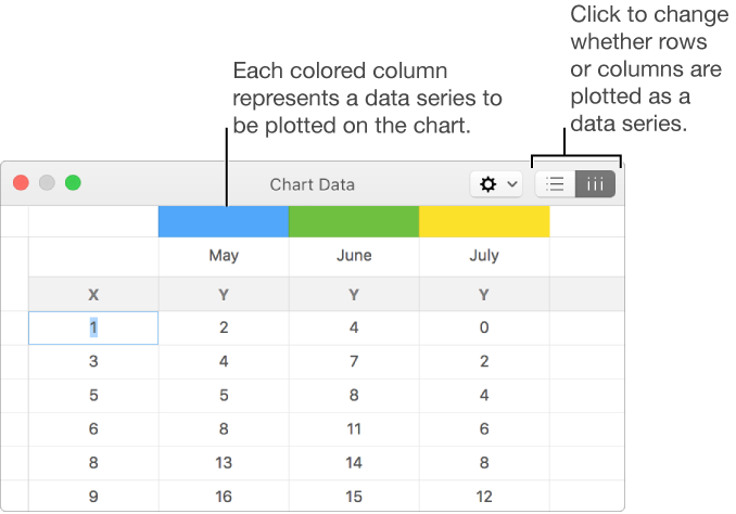
To change whether rows or columns are plotted as data series, click one of the buttons at the top-right corner of the table.
Close the Chart Data editor to return to your chart.
Create a scatter chart
Scatter charts show relationships between two or more sets of data. They display data as points and require at least two columns or rows of data (x and y values) to plot values for a single data series. By default, each data series in a scatter chart shares the x-axis value, so you need to add only an additional row or column to show another data series.
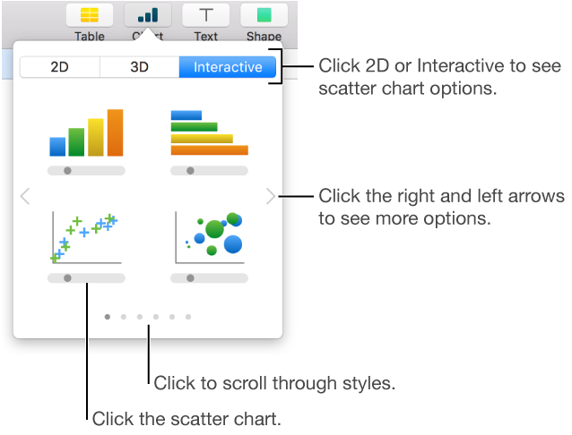
Click in the toolbar, then click 2D or Interactive (there are no 3D scatter charts).
Click the right and left arrows to see more style options.
Click the scatter chart or drag it to the slide.
To add your data, click the chart, click Edit Chart Data, then enter your data in the Chart Data editor.
Each colored row or column represents a data series to be plotted on the chart.
Do any of the following:
Change whether rows or columns are plotted as data series: Click a button in the top-right corner of the Chart Data editor.
Use a different x-axis value for each data series: Click , then deselect Share X Values. Click each cell to enter your own x and y values for the data series.
Add another data series: Type a new data series name in the next empty column (or row, if plotting by rows), then press Return.
Close the Chart Data editor to return to your chart.
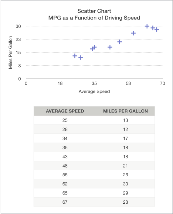
The figure below shows a scatter chart and its data. This chart shows the correlation between driving speed and gas mileage (miles per gallon).
Create a bubble chart
A bubble chart is a type of scatter, where the data are plotted as bubbles, rather than points. You can use a bubble chart to plot data with three dimensions. Each data series includes a third dimension that conveys the relationship between the compared values (x and y) and a size value (z). The size value determines the size of the bubble.
By default, each data series in a bubble chart shares the x-axis value, so you need to add only two additional rows or columns of data to show another data series. If you choose to use independent x-axis values, you need to add three additional rows or columns (x, y, and z) to show another data series.
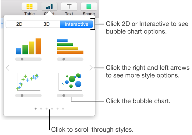
Click in the toolbar, then click 2D or Interactive.
Click the left and right arrows to see more color and style options.
Click the bubble chart or drag it to the slide.
To add your data, click the chart, then click the Edit Chart Data button near the chart.
The Chart Data Editor appears with placeholder data (x-axis, y-axis, and size values). Each colored column represents a data series to be plotted on the chart.
Click each cell to enter your own x, y, and size values for the data series.
To add another data series, type a new data series name in the next empty column (or row, if plotting by rows), then press Return.
To change whether rows or columns are plotted as a data series, click a button at the top-right corner of the Chart Data Editor.
If you don’t want to use the same x-axis values for each data series, click , then deselect Share X Values.
Click the Series tab at the top of the sidebar on the right.
If you don’t see a sidebar, or the sidebar doesn’t have a Series tab, click in the toolbar.
In the Bubble Data section of the sidebar, click the size values pop-up menu, then choose how you want to represent bubble size values (area or diameter).
To show bubbles with a negative value, select the “Show negative bubbles” checkbox.
Close the Chart Data editor to return to your chart.
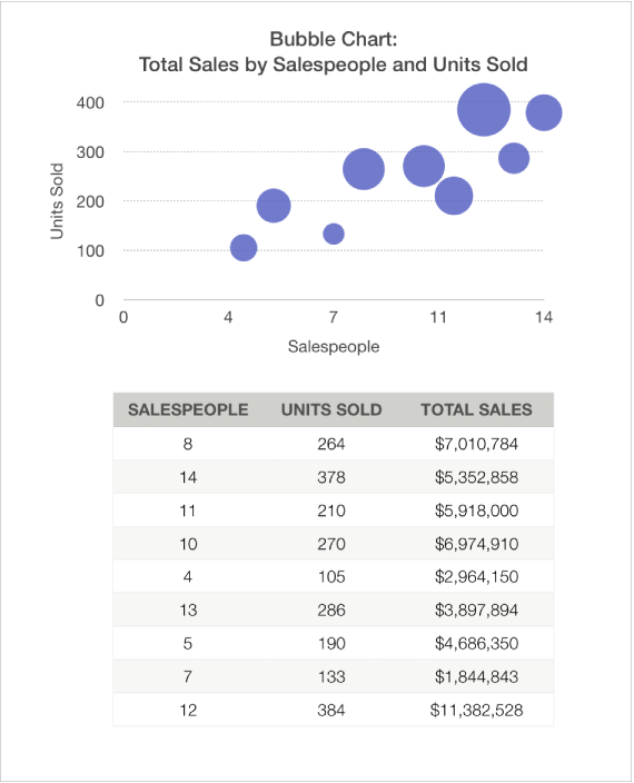
The figure below shows a bubble chart and its data. This chart shows how the number of units sold varies with the number of salespeople. The data is plotted as bubbles of varying sizes—the larger the bubble, the higher the total sales amount.
Delete a chart
Click the chart to select it, then press Delete on your keyboard.
 in the toolbar, then click 2D, 3D, or Interactive.
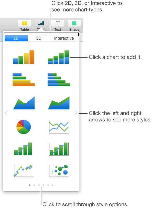
 at its center. Drag this control at any time to adjust the chart’s orientation.