
There are several types of chart markings and axis labels you can add to your charts. You can modify their appearance to emphasize your data.
Charts have a placeholder title (Title) that’s hidden by default. You can show and change the chart title.
Tap the chart, tap ![]() , then tap Chart Options.
, then tap Chart Options.
Tap Chart Title, then turn on Chart Title.
To change the alignment of the title—so that it’s on the left of the chart, for example—tap an alignment option.
To edit the title, double-tap the title, type a new one, then tap Done.
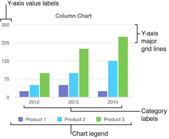
Bar, column, line, area, bubble, and pie charts have labels that show the values of specific data points. By default, these value labels are hidden for new charts, but you can make them visible and specify a format (for example, number, currency, or percentage), change their font and color, and more.
Tap the chart, then tap ![]() .
.
Tap Chart, then tap Chart Options.
Tap Value Labels.
Tap to choose the location you want the labels to appear in the chart. Tap Off to hide them.
To modify the number format for the labels, tap Chart Options again, then tap Number Format (below Value Labels).
Use the other controls to make further adjustments to the labels:
Add a prefix or suffix: The text you enter is added to the beginning or the end of the value label.
Choose how to display negative numbers: Tap “-100” or “(100).”
If you change the font for the entire chart, it also changes the font for the value labels.
You can specify which labels appear on an axis, edit their names, and change their angle.
Tap the chart, then tap ![]() .
.
Do any of the following:
Modify markings on the x-axis: Tap X Axis.
Modify markings on the y-axis: Tap Y Axis.
Use the controls to make any adjustments you want.
If you turned on Axis Name and want to change the placeholder axis name on the chart, double-tap the name on the chart, then type your own.
Note: Y-axis options may be different for scatter and bubble charts.
Tap the chart, tap ![]() , then tap X Axis or Y Axis.
, then tap X Axis or Y Axis.
Tap to turn Major Gridlines, Minor Gridlines, or Major Tick Marks on or off.
These options vary depending on the type of chart and data.
Most types of charts have axis markings, which you can modify in a number of ways. You can change which labels appear on an axis, the angle of the labels, the range and frequency of the markings, and more. You can also set whether to show chart grid lines, and specify their appearance.
Tap the chart.
Do one of the following:
Modify markings on the x-axis: Tap X Axis at the top of the pop-up menu.
Modify markings on the y-axis: Tap Y Axis at the top of the pop-up menu.
Use the controls to make any adjustments you want.
If you turn on Axis Name, Keynote adds a placeholder axis name to the chart. To change it, double-tap the name on the chart and type your own.
Tap the chart, then tap ![]() , then tap Chart.
, then tap Chart.
Tap Chart, then tap Chart Options.
Turn on Legend.
To adjust the size of the legend, tap the legend, then drag the green selection handles.
An interactive chart presents data in stages so that you can emphasize the relationship between groups of data. Interactive charts can be used to show data like sales by group over time, expenses by department, and population changes by country per continent. The example below shows the growth of three species during a three-year period.
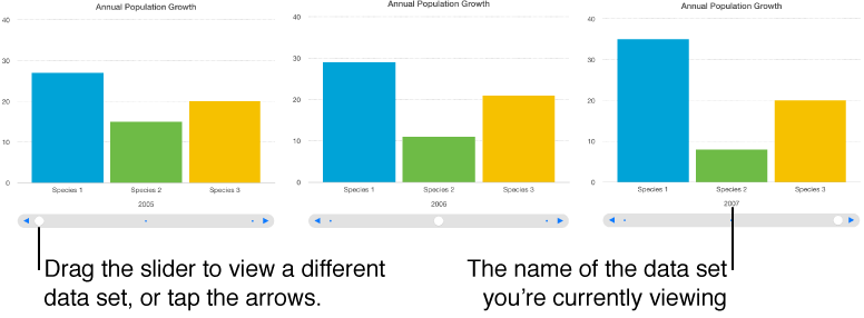
You can interact with the chart using a slider and buttons or buttons only.
Tap the chart, then tap ![]() .
.
Tap Chart, then tap Chart Options.
Tap Interactive Chart, then tap Slider and Buttons or Buttons Only.
You can add a Magic Chart build effect to an interactive chart, which animates the different chart data series.