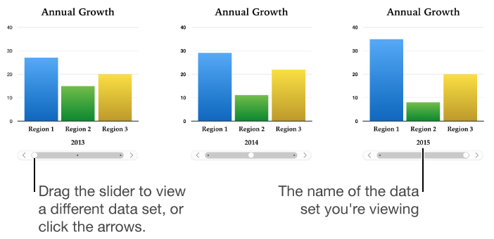
An interactive chart presents data in stages so that you can emphasize the relationship between groups of data. Interactive charts can be used to show data such as sales by group over time, expenses by department, and population changes by country per continent. The example below shows the growth of three species during a three-year period.
You can interact with the chart using a slider and buttons or buttons only.
Click ![]() in the toolbar, then click Interactive, then select a chart.
in the toolbar, then click Interactive, then select a chart.
To add your data, click the chart, click the Edit Chart Data button near the chart, then enter your data in the Chart Data editor.
You can add numbers, dates, durations, and column and row headers in the data cells. To format the numbers, select the cells, then click the Value Labels pop-up menu in the Series tab in the sidebar on the right.
If you don’t see a sidebar, or the sidebar doesn’t have a Series tab, click ![]() in the toolbar.
in the toolbar.
To change whether rows or columns are plotted as data series, click one of the buttons at the top-right corner of the Chart Data editor.
The data series are always plotted in an interactive chart, but each data set is displayed separately.
Close the Chart Data editor to return to your chart.
In an interactive chart, you can switch between the different data sets using a slider and buttons or buttons only. You choose the controls for switching between data sets.
Click the chart to select it.
Click the Chart tab at the top of the sidebar on the right.
If you don’t see a sidebar, or the sidebar doesn’t have a Chart tab, click ![]() in the toolbar.
in the toolbar.
Click the disclosure triangle next to Interactive Chart, then click the pop-up menu and choose an option.