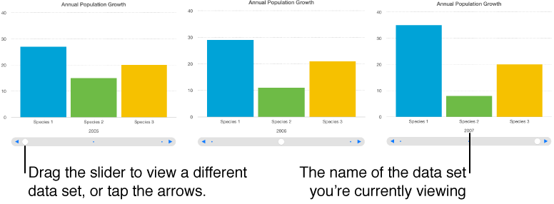
An interactive chart presents data in stages so that you can emphasize the relationship between groups of data. Interactive charts can be used to show data such as sales by group over time, expenses by department, and population changes by country per continent. The example below shows the growth of three species during a three-year period.
You can interact with the chart using a slider and buttons or buttons only.
Select the chart.
Click the Chart tab at the top of the sidebar on the right.
If you don’t see a sidebar, or it doesn’t have a Chart tab, click ![]() in the toolbar.
in the toolbar.
Click the disclosure triangle next to Interactive Chart, then choose an option from the pop-up menu.