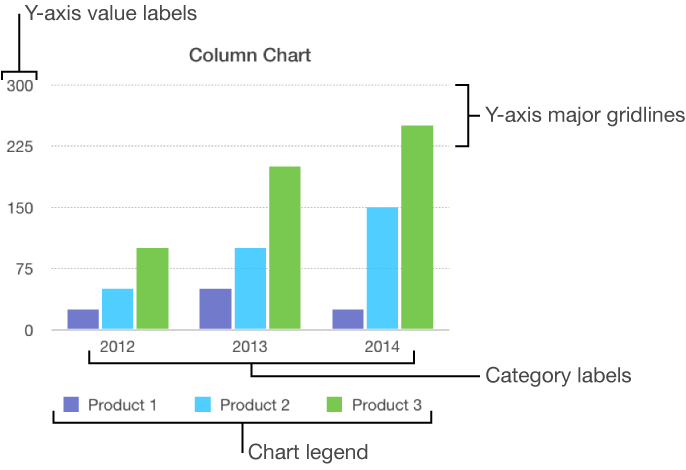

There are several types of chart markings and axis labels you can add to your charts. You can modify their look to emphasize your data.
Charts have a placeholder title (Title) that’s hidden by default. You can show the chart title and change it.
Tap the chart, tap ![]() , then tap Chart Options.
, then tap Chart Options.
Tap Chart Title, then turn on Chart Title.
To change the alignment of the title—so that it’s on the left of the chart, for example—tap an alignment option.
To edit the title, triple-tap the title, type a new one, then tap Done.
Charts have labels that show the values of specific data points. By default, these value labels are hidden for new charts, but you can make them visible and specify a format for them (for example, number, currency, or percentage), change their font and color, and more.
Tap the chart, then tap ![]() .
.
Tap Chart, then tap Chart Options.
Tap Value Labels.
Tap where you want the labels to appear on the data series (for example, Top or Middle).
To hide the labels, tap Off.
To modify the number format for the labels, tap Chart Options again, then tap Number Format (below Value Labels).
Use the controls to make further adjustments to the labels:
Set the number of decimal places: Tap the up or down arrow.
Add a prefix or suffix: The text you enter is added to the beginning or end of the label.
Choose how to display negative numbers: Tap “–100” or “(100).”
Show the thousands separator: Turn on Separator.
If you change the font for the entire chart, the font for the value labels also changes.
Tap the chart, tap ![]() , then tap Chart.
, then tap Chart.
Tap Chart Options, tap Bubble Options, then turn on Series Names.
To show value labels, tap Values, tap an option.
To change the location of the label, tap Label Location, then tap an option.
For bubble charts with overlapping bubbles, scroll down, then turn off Show Labels In Front to show only the label for the topmost bubble.
To modify the number format for the labels, tap Number Format (below Values), then choose a format.
Use the other controls to make further adjustments to the labels:
Add a suffix or prefix: The text you enter is added to the beginning or end of the label.
Choose how to display negative numbers: Tap “-100” or “(100).”
You can add reference lines to a chart to mark the average, median, minimum, and maximum values. Reference lines make a chart easier to interpret at a glance and can help you compare the values in the chart to a benchmark value.
All chart types can have reference lines, except stacked charts, two-axis charts, 3D charts, and pie charts. A chart can have up to five reference lines.
Tap the chart.
Tap ![]() , then tap the axis that shows the values in your chart—X Axis or Y Axis.
, then tap the axis that shows the values in your chart—X Axis or Y Axis.
Tap Add Reference Line, then tap any of the following:
Average: A line that runs through the mean value of the data
Median: A line that runs through the middle value of the data
Minimum: A line that runs through the lowest value
Maximum: A line that runs through the highest value
Custom: A line that runs through a value you enter in the Custom section
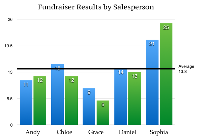
To clarify what the reference line represents, tap to turn on Show Name and Show Value.
To remove a reference line, tap the chart, tap ![]() , tap Reference Lines, tap the name of the reference line, then tap Remove Line.
, tap Reference Lines, tap the name of the reference line, then tap Remove Line.
Note: When you drag the slider on an interactive chart to view different data sets, its reference lines move.
You can specify which labels appear on an axis, edit their names, change their angle of orientation, set the range and frequency of the tick marks, and more.
Tap the chart, then tap ![]() .
.
Do any of the following:
Modify markings on the x-axis: Tap X Axis.
Modify markings on the y-axis: Tap Y Axis.
Use the controls to make any adjustments you want.
If you turn on Axis Name, Pages adds a placeholder axis name to the chart. To change it, triple-tap the axis name, then type your own.
Note: Y-axis options may be different for scatter charts and bubble charts.
Tap the chart, tap ![]() , then tap X Axis or Y Axis.
, then tap X Axis or Y Axis.
Tap the controls to turn Major Gridlines, Minor Gridlines, or Major Tick Marks on or off.
These options vary depending on the type of chart and data.
Tap the chart, then tap ![]() .
.
Tap Chart, then tap Chart Options.
Turn on Legend.
To adjust the size of the legend, tap the legend, then drag the green selection handles.
Drag the legend to where you want it.