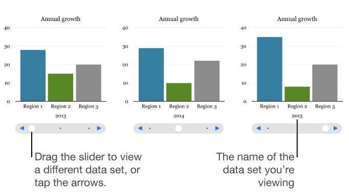

An interactive chart presents data in stages so that you can emphasize the relationship between groups of data. Interactive charts can be used to show data such as sales by group over time, expenses by department, and population changes by country per continent. The example below shows the growth of three species during a three-year period.
You can interact with the chart using a slider and buttons or buttons only.
Tap ![]() , tap
, tap ![]() , then tap Interactive.
, then tap Interactive.
Tap a chart to add it, then drag it to where you want it on the page.
To add or edit the data, tap the chart, tap Edit Data, then do any of the following:
Enter data: Tap placeholder text, then enter your own data.
Enter dates, times, and durations: Tap ![]() , turn on Full Keyboard, then enter your data.
, turn on Full Keyboard, then enter your data.
Change whether rows or columns are plotted as a data series: Tap ![]() in the toolbar, then tap an option.
in the toolbar, then tap an option.
Tap Done in the toolbar.
In an interactive chart, you can switch between the different data sets using a slider and buttons or buttons only. You choose the controls for switching between data sets.
Tap the chart, then tap ![]() .
.
Tap Chart, then tap Chart Options.
Tap Interactive Chart, then tap Slider and Buttons or Buttons Only.