Create a scatter chart

Scatter charts display data differently from the other kinds of charts. They require at least two columns or rows of data to plot values for a single data series. To show multiple data series, you use additional two-column or two-row pairs.

There are two ways to create a scatter chart. You can add a blank chart and then select the table cells with the data you want to use. Or, you can select table cells first, then create a scatter chart that displays the data. Either way, when you change the data in the table, the chart updates automatically.

This topic describes how to add a chart then select data.

Create a scatter chart

  1. Click Chart in the toolbar, then select the type of scatter chart you want to add.

    Click the 2D or Interactive tabs to see all the options; there are no 3D scatter charts.

  2. Click Add Chart Data.

  3. Select the table rows or columns with the data you want to use by clicking the numbered or lettered bar for those rows or columns.

    You can select rows or columns from one or more tables, including tables on different sheets.

    If you select two columns: The scatter chart plots one data series. The first column selected determines the x-axis values and the second column determines the y-axis values.

    If you select more than two columns: The first column selected determines the x-axis values and each additional column selected creates a new series (and determines the y-axis values for that series).

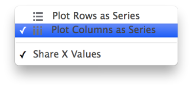
    To have each scatter series use a different column for the x-axis values, deselect Share X Values from the pop-up menu in the bar at the bottom of the window.

    If you select only a single column: The scatter chart plots the data similar to a line chart, with the values from the selected column along the y-axis.

  4. To change whether rows or columns are plotted as series, choose an option from the pop-up menu in the bar at the bottom of the window.

    Bar showing options to plot rows or columns as series

  5. Click Done.

Share the x-axis for multiple values along the y-axis

Sharing the x-axis means plotting a single kind of value along the x-axis, while allowing for multiple kinds of values to be plotted along the y-axis.

  1. Select the chart, then click Edit Data References.

  2. Choose Share X Values from the pop-up menu in the bar at the bottom of the window.

    Bar showing options to plot rows or columns as series

    Pop-up menu for advanced plotting options

  3. Click Done.

At any time you can add or remove the data ranges that the chart refers to. To learn how, see Modify chart data references.

If you can’t edit a chart, it may be locked. To edit it, you must unlock it.