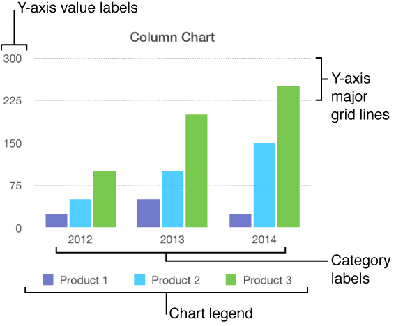
There are several types of chart markings and axis labels you can add to your charts. You can modify their appearance to emphasize your data.
To edit a chart, make sure it’s unlocked.
Charts have a placeholder title (Title) that’s hidden by default. You can show the chart title and change it.
Tap the chart, tap ![]() , then tap Chart Options.
, then tap Chart Options.
Tap Chart Title, then turn on Chart Title.
To change the alignment of the title—so it’s on the left of the chart, for example—tap an alignment option.
To edit the title, triple-tap the title, type a new one, then tap Done.
Charts have labels that show the values of specific data points. By default, these value labels are hidden for new charts, but you can make them visible and specify a format (for example, number, currency, or percentage) for them, change their font and color, and more.
Tap the chart, tap ![]() , then tap Chart.
, then tap Chart.
Tap Chart Options, tap Value Labels, then tap a location for the labels (for example, Top or Middle), which refers to where they appear on the data series in the chart.
To modify the number format for the labels, tap Chart Options again, tap Number Format (below Values), turn off Same as Source, then choose a format.
If Same as Source is turned on, the value labels match the format of the original data in the table.
Use the other controls to make further adjustments to the labels:
Add a suffix or prefix: The text you enter is appended or prepended to the value label.
Choose how to display negative numbers: Tap “-100” or “(100).”
If you change the font for the entire chart, it also changes the font for the value labels.
Tap the chart, tap ![]() , then tap Chart.
, then tap Chart.
Tap Chart Options, tap Bubble Options, then turn on Series Names.
To show value labels, tap Values, then tap an option.
To change the location of the label, tap Label Location, then tap an option.
If your chart has overlapping bubbles, turn off Show Labels In Front (scroll to the bottom to see it) to show only the label for the topmost bubble.
To modify the number format for the labels, tap Chart Options again, tap Number Format (below Values), turn off Same as Source, then choose a format.
If Same as Source is turned on, the value labels match the format of the original data in the table.
Use the other controls to make further adjustments to the labels:
Add a suffix or prefix: The text you enter is added to the beginning or end of the value label.
Choose how to display negative numbers: Tap “-100” or “(100).”
Most types of charts have axis markings, which you can modify in a number of ways. You can change which labels appear on an axis, the angle of the labels, the range and frequency of the markings, and more. You can also set whether to show chart grid lines, and specify their appearance.
Tap the chart.
Tap ![]() , then tap X-Axis or Y-Axis.
, then tap X-Axis or Y-Axis.
Use the controls to make any adjustments you want.
If you turn on Axis Name, Numbers adds a placeholder axis name to the chart. To change it, double-tap the name on the chart, then type your own.
Tap the chart, tap ![]() , then tap Chart.
, then tap Chart.
Tap Chart Options, then turn on Legend.
To adjust the size of the legend, tap the legend, then drag the green selection handles.
Drag the legend to where you want it.