Scatter charts show relationships between two or more sets of data. They display data as points and require at least two columns (or rows) of data to plot values for a single data series. By default, each data series in a scatter chart shares the x-axis value, and therefore, you need to add only one additional row or column to show another data series.
Bubble charts are similar to scatter charts, except that each data series in a bubble chart includes a third dimension that conveys the relationship between the compared values (x and y) and a size value (z). The data is plotted as bubbles of various sizes—the size value (z) determines the size of the bubble.
There are two ways to create these charts. You can add a blank chart and then select the table cells with the data you want to use. Or, you can select table cells first, then create a chart that displays the data. Either way, when you change the data in the table, the chart updates automatically.
This topic describes how to add a chart then select data.
Tap
, then tap
.
Tap 2D or Interactive to see all the options; there are no 3D scatter charts.
Tap a scatter chart to add it.
Tap the chart, then select the table rows or columns with the data you want to use.
You can select rows or columns from one or more tables, including tables on different sheets. Do one of the following:
Select two columns or rows: The scatter chart plots one data series. The first column selected determines the x-axis values, and the second column determines the y-axis values.
Select more than two columns or rows: The first column selected determines the x-axis values, and each additional column selected creates a new series (and determines the y-axis values for that series).
If you want each scatter series to use a different column for the x-axis values, tap
in the toolbar, then tap Don’t Share X Values.
Select only a single column or row: The scatter chart plots the data similar to a line chart, with the values from the selected column along the y-axis.
Tap Done in the toolbar.
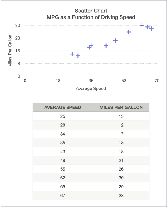
The figure below shows a scatter chart and its data. This chart shows the correlation between driving speed and gas mileage (miles per gallon).

A bubble chart is a type of scatter chart, where the data are plotted as bubbles of varying sizes, rather than points. You can use a bubble chart to plot data with three dimensions. Each data series includes a third dimension that conveys the relationship between the compared values (x and y) and a size value (z). The size value determines the size of the bubble.
By default, each data series in a bubble chart shares the x-axis value, so you need to add only two additional rows or columns of data to show another data series. If you choose to use independent x-axis values, you need to add three additional rows or columns (x, y, and z) to show another data series.
Tap
, then tap
.
Tap 2D or Interactive to see all the options; there are no 3D bubble charts.
Tap a bubble chart to add it.
Tap the chart, then select the table rows or columns with the data you want to use.
You can select rows or columns from one or more tables, including tables on different sheets. Do one of the following:
To plot one data series: Select three columns. The first column selected determines the x-axis values, the second column determines the y-axis values, and the third column determines the size of the bubble.
To plot more than one data series: Select sets of three columns. The bubble chart plots each group of three columns as one data series. The first column selected determines the x-axis values, the second column determines the y-axis values, and the third column determines the size of the bubble.
To have each bubble series share one column for the x-axis values, tap
in the toolbar, then tap Share X Values. In this case, select sets of two columns for each additional data series.
To use data from a single column: Select the column. The bubble chart plots the data similar to a line chart, with the values from the selected column along the y-axis.
To change whether rows or columns are plotted as the data series, tap
in the toolbar, then tap an option.
Tap Done in the toolbar.
The figure below shows a bubble chart and its data.This chart shows how the number of units sold varies with the number of salespeople. The data is plotted as bubbles of varying sizes—the larger the bubble, the higher the total sales amount.

Sharing the x-axis means plotting a single kind of value along the x-axis, while allowing for multiple kinds of values to be plotted along the y-axis. By default, the x-axis values are shared among multiple sets of y-axis values in some types of charts.
Tap the chart, then tap Edit References.
Tap
in the toolbar, then tap Share X Values.
Tap Done.
You can change the data reflected in the chart at any time. To learn how, see Modify chart data references.