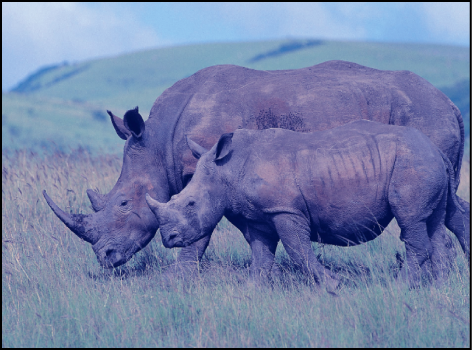
Color balance refers to the relative strength of the red, green, and blue channels that constitute an image. For example, a blue-tinted image has a strong blue channel and weaker green and red channels.
For an example of using the Color Balance filter to match two composited layers, see Example: Use a filter to color-match two composited layers.
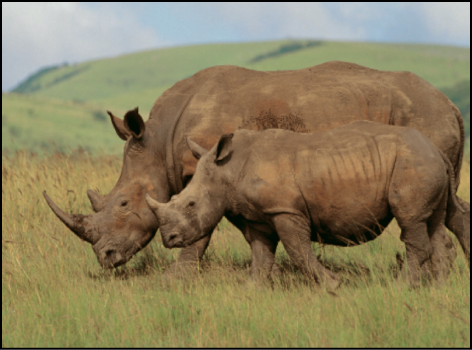
The Color Balance filter lets you adjust the relative balance of all three color channels of an image at once—for example, lowering the blue channel and raising the red and green channels to reduce blue tinting and yield an image that appears more orange and warm.
Color balance also relates to color temperature, which describes the quality of light in an image. For example, sunlight is generally more bluish than tungsten light, which is more orange. In professional film and video productions, white-balancing the camera before shooting usually ensures that whites in an image are neutral (with all three color channels balanced evenly). However, film stocks, optical filters, and digital white-balance settings can modify the tint of an image.
Note: The imbalanced color channels caused by a dominant color temperature in the lighting of an image is often referred to as a color cast.
You can use the Color Balance filter to adjust the three color channels of an image to eliminate a color cast or introduce one. Here are some uses for the Color Balance filter:
Correct problems in lighting: For example, you can rebalance an image that’s too orange to appear more neutral.
Match two images to one another: For example, you can match the quality of light on an actor in a foreground green screen clip to the lighting in a background image.
Stylize the color of an image used in a creative composition: For example, you can create a high-contrast, blue-tinted silhouette from the image of two actors dancing for a title sequence.
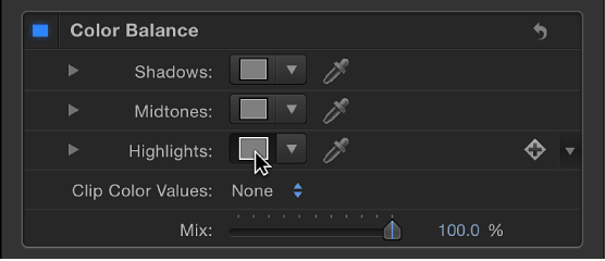
The Color Balance filter doesn’t just let you rebalance the overall strength of an image’s three color channels, it also lets you rebalance color specifically in three tonal zones of an image: shadows, midtones, and highlights. Three correspondingly named color controls let you make color balance adjustments in each zone of image tonality.
To make an adjustment to a zone, click the corresponding color well to open the Mac OS Colors window, then drag in the color wheel. As you drag, the image updates. Dragging in a specific hue’s direction rebalances the image, tinting it with that hue. The farther toward the edge of the color wheel you drag, the more intensely you tint the image.
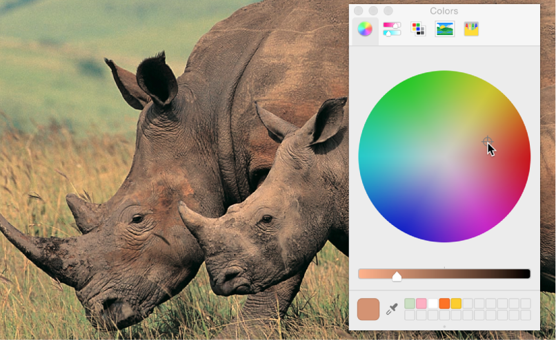
Tip: You can use any controls in the OS X Colors window to make color adjustments, including sliders, web-safe colors, and the magnifying glass picker. Further, you can save frequently used tints by dragging a color from the color bar at the top to an empty white swatch below. Clicking a filled swatch selects that color.
The adjustments to shadows, midtones, and highlights of an image overlap widely. For example, adjustments to shadows affect the darkest parts of the image the most, but the effect also influences midtones and lower highlights. This overlap ensures that adjustments you make blend seamlessly with the original colors of the image.
Note: Although you can make small contrast adjustments using the vertical lightness slider in the color wheel pane of the Colors window, it’s better to use a Contrast filter or a Levels filter to make adjustments to the overall lightness and darkness of an image.
Adjust this filter using the parameter controls in the Filters Inspector:
Shadows: Adjusts color channels in the darkest regions of the image. Click the color well to open the Colors window, then adjust the color balance of the darkest portion of the image. An eyedropper lets you sample any color in the Canvas to use for balancing the image. You can also click the disclosure triangle to reveal individual red, green, and blue channel sliders, with a numeric range from 0 (no color) to 0.5 (unaltered color) to 1.0 (maximum color).
Midtones: Adjusts color channels in midtone regions of the image. Click the color well to open the Colors window, then adjust the color balance of the range of color falling between shadows and highlights. An eyedropper lets you sample any color in the Canvas to use for balancing the image. You can also click the disclosure triangle to reveal red, green, and blue channel sliders with a numeric range from 0 (no color) to 0.5 (unaltered color) to 1.0 (maximum color).
Highlights: Adjusts color channels in the lightest regions of the image. Click the color well to open the Colors window, then adjust the color balance of the brightest portion of the image. An eyedropper lets you sample any color in the Canvas to use for balancing the image. You can also click the disclosure triangle to reveal red, green, and blue channel slider with a numeric range from 0 (no color) to 0.5 (unaltered color) to 1.0 (maximum color).
Boost: Multiplies the values set in the Shadows, Midtones, and Highlights parameters. This is useful when using Color Balance for exposure balancing, allowing you to “blow out” an image. A boost applied to strong colors may yield unexpected results.
Clip Color Values: Turns clipping on and off. Clipping prevents color adjustments from forcing color values out of the allowable digital range. Clipping can prevent illegal signal levels in clips that are output to video. There are four menu options:
None: No clipping occurs.
At White: Any color channel exceeding the maximum value of 1 is clipped to 1.
At Black: Any color channel falling below the minimum value of 0 is clipped to 0.
At Black and White: All color channels are clipped to a minimum of 0 and a maximum of 1.
Mix: Sets the percentage of the original image to be blended with the color-corrected image.